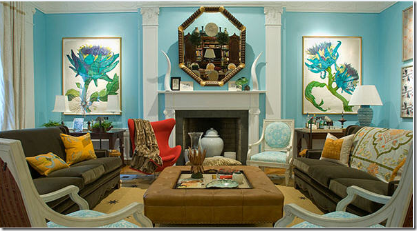
 Two weeks ago on The Skirted Roundtable (listen here if you missed it) Linda, Megan and I got into a heated discussion about Bunny Williams’ Kips Bay Showhouse living room – which landed on the cover of the August issue of House Beautiful. Linda actually posed the question to Megan and I - “is this room truly great because Bunny Williams designed it?” House Beautiful proclaimed just exactly this: that what made the room great was that Williams had designed it. Well, the three of us didn’t quite agree with the magazine. And though Bunny Williams is a personal favorite of mine, I think I liked the room the least of us three. That discussion on the Skirted Roundtable was really all in fun – certainly we realized the irony which prompted the question “Who do we think we are?” to challenge Bunny Williams on design? Megan compared it to telling Yves St. Laurent to stop with the flourishes. Yes, it is very amusing to imagine. But in truth, the discussion garnered quite a lot of comments from people – some agreed with us and some very esteemed people disagreed. One blogger most knowledgeable about design, Aesthete's Lament, said he had actually been in Bunny’s Kips Bay room and found “the space itself was glorious and did not lend itself well to being photographed. I stood in that room, for a very long time, and that was really the only way to understand the space. When you stood in the room, with the sunlight seeping in through the windows, the lamps turned a bit low, et cetera, it was wonderful and alluring and fresh.” Toby Worthington, a highly intelligent commenter proclaimed “Bunny Still Rules.” Even the editor in chief of House Beautiful, Stephen Drucker, weighed in with: “Fascinating. Wish I could have joined the skirted roundtable for this one. This is what magazines are all about: love it/hate it. Interesting to note... we've been deluged with requests for the coffee table in Bunny's room.” Trust us, Mr. Drucker, we would have loved to have you on and join in on the discussion.
Still, as much fun as it was to dissect the Kips Bay room, I feel a little uneasy about it all. After all, Bunny Williams is and remains a favorite of mine. Her book, An Affair with a House, has to be one of the top ten design books ever written. Each page has a glorious picture of her Connecticut farmhouse – there are very few design books I have loved so or felt such an emotional connection to. All I want is one day to stand in the rebuilt barn and take in the beauty of that room in person. Put it on my bucket list, along with visiting Villa di Lemma. So, today, apart from my Skirted Roundtable partners, I revisit the Williams’ Kips Bay all-in-one living space, with a little background history first.
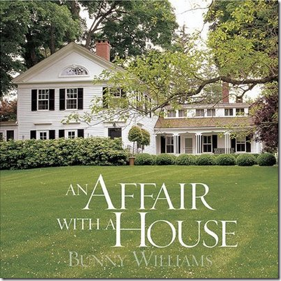 One of my top five favorite design books published. The story of the evolution of Bunny Williams country house – with the addition of husband John Rosselli’s influence along the way. Fabulous.
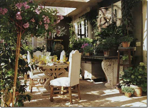
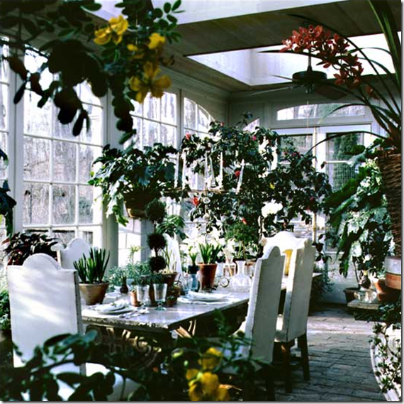
The first time I was ever exposed to Bunny Williams was with a photograph of her beautiful conservatory – constructed from a pile of old French doors she had found. This room was my introduction to Williams which started a long love affair.
Another view of the room.
And here: you can see the doors that make up the conservatory along with the old brick floor. The ceiling is all skylights. This is the site of many dinners parties at the Connecticut farmhouse.
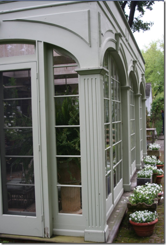
A rare shot of the outside of the conservatory.
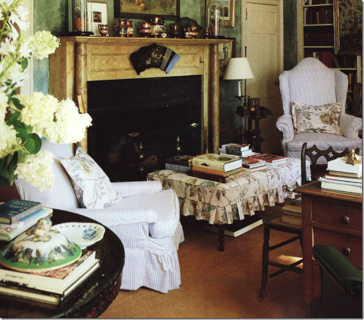
Originally, it was Bunny’s great handling of the English Country Manor look that attracted me. A cluttered look with books piled everywhere, slips in ticking and Colefax and Fowler fabrics, fabulous antiques – and even more fabulous accessories – this style of design was a favorite of mine for years and still today, I have a soft spot for it. Bunny’s country house was not about being neat and tidy. It was about really living in a house and enjoying it – gardening, reading books, having an early evening drink with visiting guests, sitting around a fireplace, enjoying home cooked meals with dogs and chickens running to and fro. It was about a house that was well used and well loved.
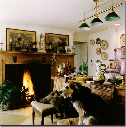
The kitchen in the Connecticut house. What’s there not to love about a room like this?
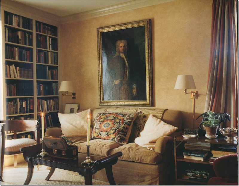
The library in the original house on the estate. Is this America or England? Hard to tell, which is part of Williams’ appeal.
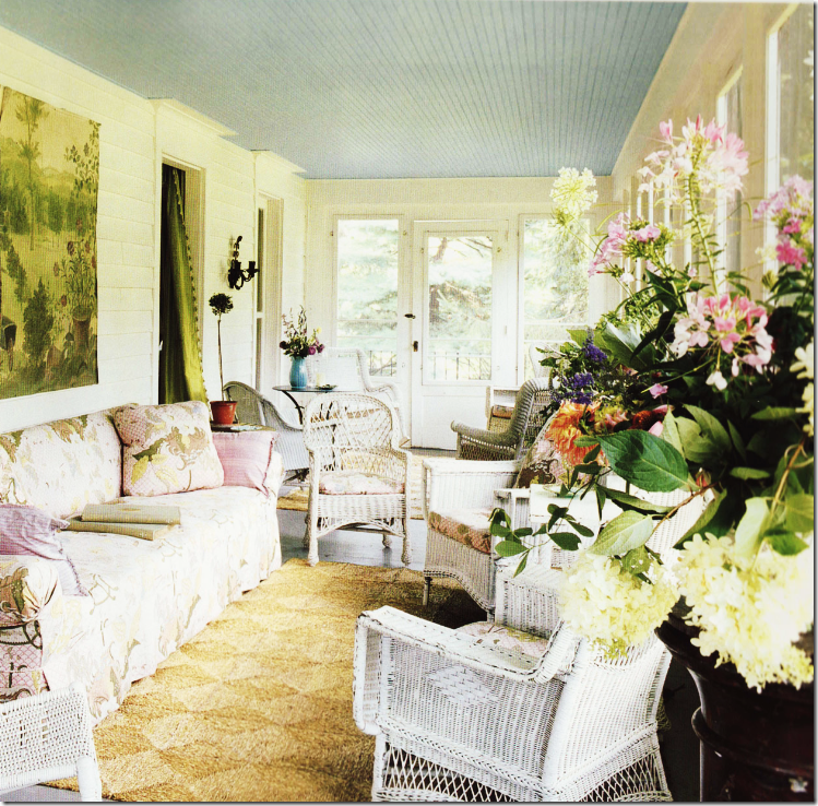
An early picture of the side porch of the main house.
And a later, a more styled picture from the same porch with new slips and chairs.
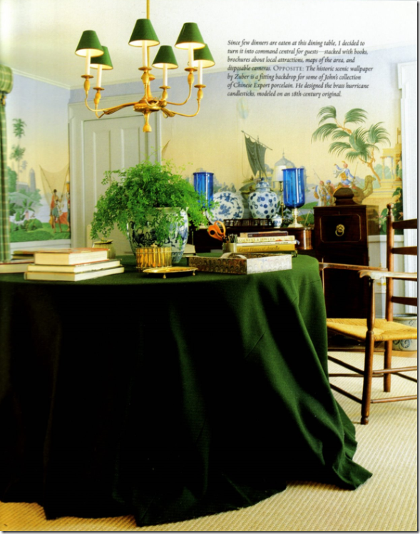
After her next door neighbor fabric designer Alan Campbell died, Bunny bought his house to keep for guests. She turned his dining room with the Zuber wallpaper into a library of sorts – since meals aren’t really eaten here anymore.
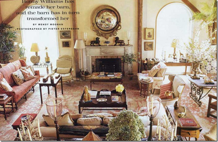
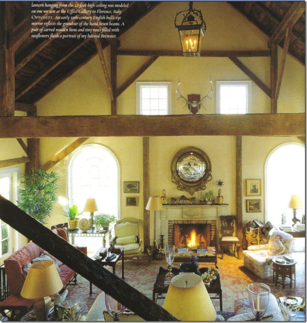
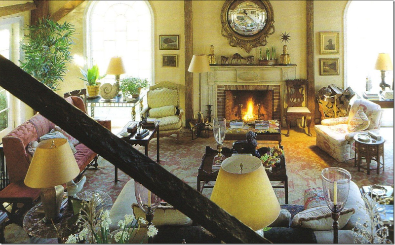
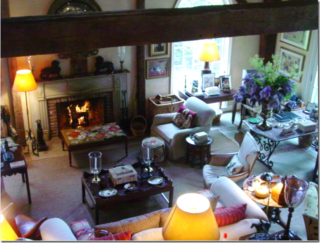
One of my favorite rooms ever – the barn/garage that Bunny’s husband John Rosselli eyed for renovation. The final results is a huge, high ceilinged space where most of the entertaining at Connecticut happens. The scale of the furniture is purposefully large to fill the space. Looking at this room, it somehow reminds me of the Kip Bay room – large, tall ceilinged and multi purposed. Like I said, one day I want to experience this room.
Another view shows how tall the room actually is.
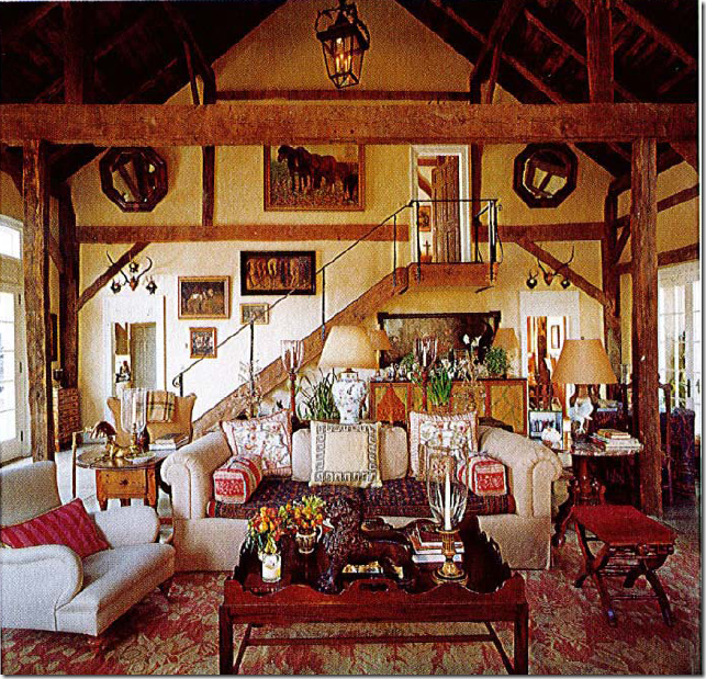
Looking the other way – you can see the stairs that lead to a bedroom. The rug is amazing. Again – is this America or some house in the countryside of England? No one does English country better than Williams. Once she said she can do an English styled room with her eyes closed – it comes that easy to her.
A close up of the great room – high back antique sofa, I spy a comfy club chair in a famous Robert Kime fabric, lots of hurricanes, English tables, and wonderful lamps. The rug is truly amazing.
A very recent shot of the barn – the Kime chair is now recovered. Otherwise everything looks very much the same except for the rug! Where is the gorgeous rug?
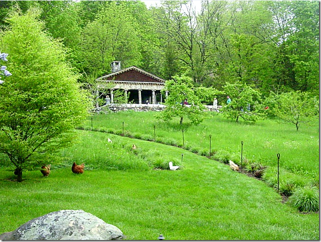
The pool house sits high on a bluff while the chickens just roam around. This picture was taken on a garden tour this year that also included Michael Trapp’s former house.
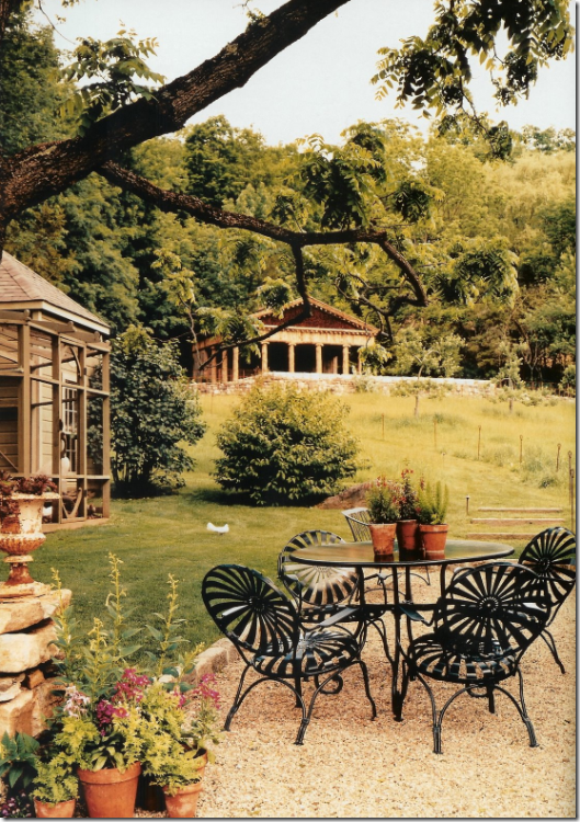
A view of the aviary and the pool house in the back, taken from a magazine spread.
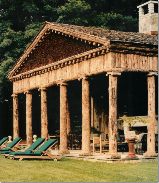
Close up the unusual pool house designed by Bunny and John to resemble a Greek temple made out of wood, not marble.
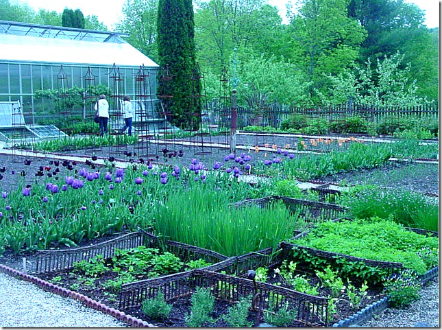
Spring flowers and vegetables growing behind the large working greenhouse.
In New York – Bunny and Rosselli live a slightly dressier and more sophisticated life, their love of antique furniture is evident here as is their love of wall to wall seagrass (had to throw that in, of course!)
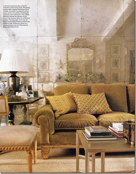
The living room in their New York apartment has a wall of antiqued mirror – used to great effect!
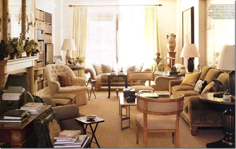
A wider shot of the living room with the antiqued mirrors – just gorgeous. I love the barrel back chairs and the day bed in front of the window. The apartment has a beautiful array of antique furniture and comfortable upholstered pieces – exactly what you would expect from a dynamite pair such as Williams and Rosselli. Don’t you wonder which one has the final say in the design of their living spaces?
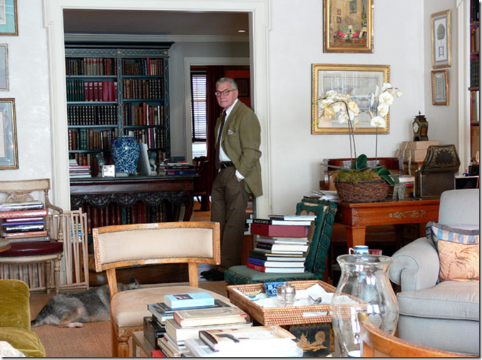
The handsome and debonair John Rosselli poses in their New York apartment, courtesy of New York Social Diary.
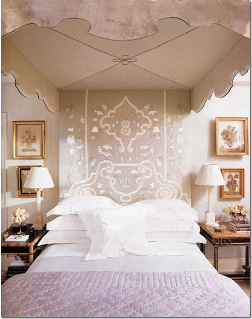
Most amazing is their mirrored bed from the 1930’s paired with an Indian textile. Williams is known for sumptuous bedrooms.
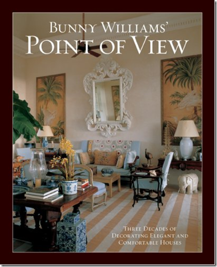
Williams third book, Point of View, is an overview from her thirty years of designing interiors. The cover shot, though, is highly personal and shows the house in Punta Cana that she and Rosselli recently built. Again, this room reminds me of the Kips Bay room with it’s high ceilings and large art work. Doesn’t this room seem like a beach styled version of her large barn room in Connecticut? I adore this room!!
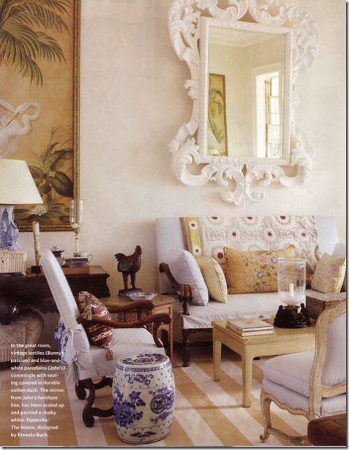
A close up – I love the striped dhurri rug and the antique settee and Os de Mouton chair flanked by the blue and white garden seat. Just beautiful!
A close up of the room from the book – you can only see one side of the large room in these pictures – actually it is double sized – with the other side being a mirror image.
I love this picture – all the dogs, the books, the white linen, the tapestry, the slips – look how huge that sofa truly is!!! What a cute couple they make. John is not too handsome is he?
I particularly like this dining room designed by Bunny Williams – it’s soft moss green walls lined with a set of china, a table skirted, and beautiful painted chairs.
Another beautiful living room designed by Williams that has the feel in layout of her Kips Bay room – the sitting area is one side, the dining room the other. What a glorious room!
Another large living room, with multiple seating areas, just like the Kips Bay living room. Isn’t that painting gorgeous – it makes the entire room!
Another beach styled room, large, high ceilinged - an eating and living space in one – just like Kips Bay.
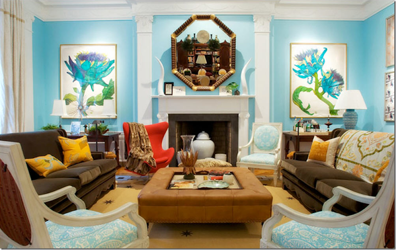
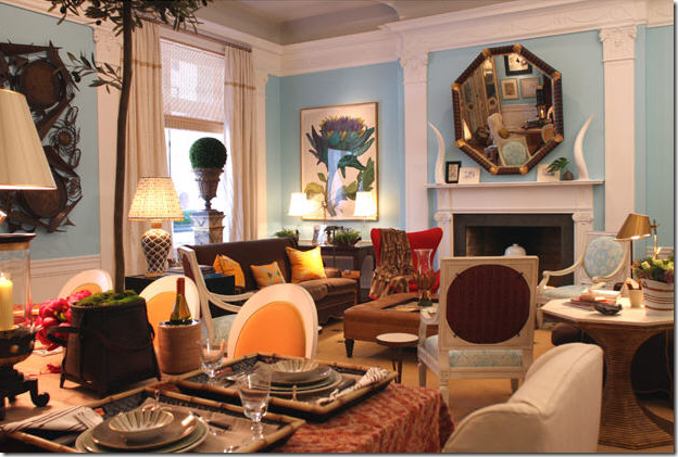
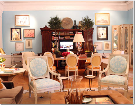
Which brings us back to the room being discussed – the Kips Bay Showhouse – all in one room, that Williams designed this year. The turquoise blue walls were paired with the furniture from her new line – BeeLine Home. Megan and Linda liked the blue walls – I did too, just not with the olive-green sofas from her Bee Line furniture.
The famous red chair that caused a lot of discussion – do you like it mixed with the blue and the olive greens? And another big topic for discussion was the red fabric on the back of the white chairs – love it/hate it?
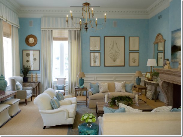
After we taped the Skirted Roundtable, Megan sent me this picture – from Mrs. Howards - and said this reminded her of the Kips Bay room- the wall color. Yes, it is very similar. Megan thought the blue walls in Kips Bay looked good toned down by the olive colored upholstery or else the turquoise would have looked too themed or juvenile. Well – here the same blue walled room looks neither themed or juvenile. I think this is beautiful and calm, perhaps expected and a little boring compared to the Kips Bay room, but it does seem to make sense.
My main issue with the room was I thought it was two designs in one – there was the beautiful art work which explained the turquoise walls and the white chairs with blue fabric. And, the olive green sofas with the saffron yellow pillows is another design element. It seems that there are two design themes going on in this room where there should be one.
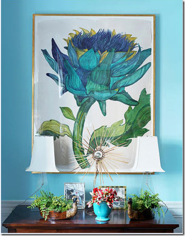
The two design elements in the room: blue walls and fabric inspired by the art work, which I love.
The second element: The olive green sofas and tan leather ottoman mixed with saffron pillows and textiles.
Megan and Linda objected most to the space planning, they felt there was too much going on in the room. That wasn’t my thought. That is Bunny – that is what she does best. My problem was the blue design/olive design happening in the same room. And the red chair.
Here, you can’t really see the olive sofas with the yellow tapestries – so it looks good from this angle. At first glance, I thought the red chair was a stroke of genius. The longer I studied it, the less I thought that. I think I will go to my maker never understanding the red chair mixed with the blue/ green element, mixed with the olive/yellow element. The three of us agreed that we didn’t especially love the painted rug either, do you?
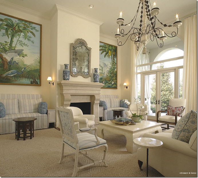
Here’s another large room that reminds me of Bunny’s Kip Bay room – the large art work flanking the fireplace, yet the design of this room makes sense to me. Or is it too boring and bland compared to the Kips Bay room? Myself, I could live here and be happy.
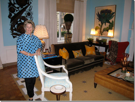
Ms. Williams on the opening night of Kips Bay stands in her room. Why do I even care if I like this room or not? I never even gave it a second thought until it landed on the cover of House Beautiful. I usually adore everything this woman creates! I have never not understood anything she’s designed before. Oh, well. What do you think? Do you love it and think I’m crazy?
To judge the new furniture line away from the turquoise blue walls at Kips Bay – here is a room set up with the Beeline Home furniture – doesn’t this show off her new furniture line to its best advantage? I adore this!! It’s so Bunny!! (picture sent to me from Mrs. Blandings via Chris Wiggins via Beeline Home web site – thank you!)
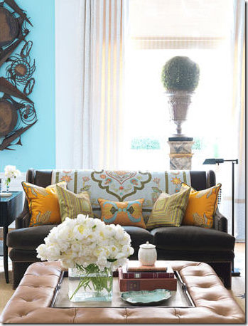
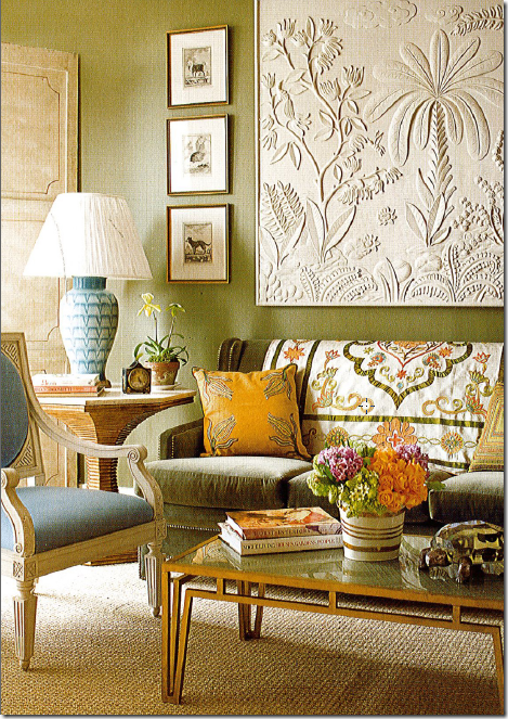
A different room set up with her Beeline Home furniture – again – beautiful! I love that tapestry on the back of the sofa – I would love to own that!! Here the walls have been painted the same color as the sofa, it is so beautiful – and the art work – the same as used in Kips Bay looks even better here too, for some reason. I love this blue mixed with the green here – it is more toned down than the turquoise, it looks perfect!
Another vignette showing the wonderful desk and mirror - love this. And I love the bunny rabbit too!
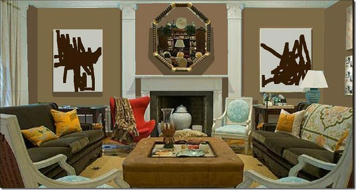
Which brings me really to the point of all this! A reader listened to the Skirted Roundtable discussion and was moved to create the room he felt Bunny Williams SHOULD have designed, God help us! Like I said - who do we think we are? The reader is Magnaverde, aka Bart, interior designer, and a prolific commenter with a wonderful apartment that was featured in Oprah Winfrey’s O Home magazine. Here it is – Magnaverde’s version of the Kips Bay room:
Kips Bay as it should have been - Magnaverde: The blue elements have disappeared except for the chairs. The blue/green art work has been changed out for modern works in brown and white. The walls have become a dark caramel tone to blend in more with the coffee table and olive green sofas. The white horns on the mantel are gone – the mirror makes more sense now without them. The red chair remains and it does looks wonderful. I’m such a matchy matchy person – I would have changed the blue fabric on the chairs to the saffron color, but that’s me. What do you think? Better? Worse? Leave this to the professionals? Thank you Magnaverde for your drawing – I love it!!! To see pictures of Magaverde aka Bart’s most delicious apartment, go here, and here.
Hopefully now I will put this issue to bed. There’s a new House Beautiful out – with Windsor Smith’s new house on the cover and I’m in love!!! Her kitchen! Her pink study! AND – there’s a gorgeous house in Austin, Texas – done up all in Belgian linen slipcovers that is just to die for. House Beautiful proves again – they are THE magazine to reckon with now. Each month, it gets better and better and this month is a killer. Thank you Mr. Drucker!
To listen, or relisten to our discussion of the Kips Bay room on The Skirted Roundtable, go here.
