One of my all time favorite design magazine stories concerned a house that was decorated primarily in pinks. The young owner had a life long obsession with the color and was determined to live with it. She was very definite about her colors - it was not just any pink that she loved, instead it was a most specific shade, a blue-pink. Apparently her mother also shared a love of this same color and the owner had grown up around it – it was in her blood, you might say. Enter interior designer Suellen Gregory, from Richmond, Virginia, who fulfilled the owner’s pink fantasy by creating the house of her dreams. The Pink House first appeared as the cover story of Traditional Home, September, 2003. I remember it well. We were vacationing on the beach when the issue came out and my copy of the magazine went home sandy, stained, and dog-eared. I loved everything about the house and remember feeling a pang of envy that here was someone with enough self confidence to actually take such a ravishingly feminine color and use it throughout, without any regards to what people might think of a pink-filled house!
The story of the Pink House appealed to a lot of people, not just myself. For years afterwards the house showed up time and again in various sister publications. My well-read copy of the original article remained on my desk –hoping for that one client who would also want that perfect shade of pink. As it so happened, one day I decided to research the designer online and there, lo and behold, was the Pink House on Gregory’s web site, except it had been totally transformed! The house was now redecorated all in white, with just a few accents of a deeper, hotter pink. I found the comparison between the pink rooms versus the white rooms fascinating, and even wrote about the two different color schemes in the early days of my blog. I polled the readers as to which they liked better – the pink decor or the white version? It was all in great fun, and an associate of Ms. Gregory, Megan Lowden, emailed me, thanking me for the story. Megan and I have kept in touch through the years and she recently let me know that Ms. Gregory had just gone online with a brand new website. Would I like to feature it, she wondered? You bet I would! I adore Ms. Gregory’s style – a genteel southern brand of design that is heavy on the classics, the kind of decorating that stands the test of time. Gregory, eschewing trendiness, creates a decor that looks as good today as it did yesterday and will tomorrow. Her designs speak to me – I love her silk taffeta curtains, her use of French antiques, her ability to effectively mix the modern and the ancient, all the while creating a cozy and warm ambience. Of course it would be my pleasure to promote her new web site!
Well designed web sites are as important today to the interior design profession as is a well designed space, and Gregory’s new site does not disappoint. The images are large and bright, focused and professional – something that many others lack. The site is straightforward and not overburdened with lots of gimmicky flash intros. It’s easy to navigate and best of all – there are plenty of magazine layouts in PDFs. Perhaps the most surprising part of the website was who designed it – Coleen Rider, the owner of Coleen and Co., a hugely popular design store in Los Angeles. Coleen and Co. is one of the design blogosphere’s favorite retail spots, but did you know that Coleen designed web sites too? Neither did I!! To me, Coleen is famous enough for her ultra fabulous tent-lanterns, her one-of-a-kind tole lighting fixture that has been the rage on so many blog and magazines. Yet, wearing another hat, Coleen develops web sites and other business branding product, a hobby that has turned into a satisfying and lucrative business. Today, I am thrilled to show you Suellen Gregory’s new site, designed by Coleen Rider – I hope you enjoy it as much as I do!
The epitome of southern grace and charm, Ms. Suellen Gregory from Richmond, Virginia.
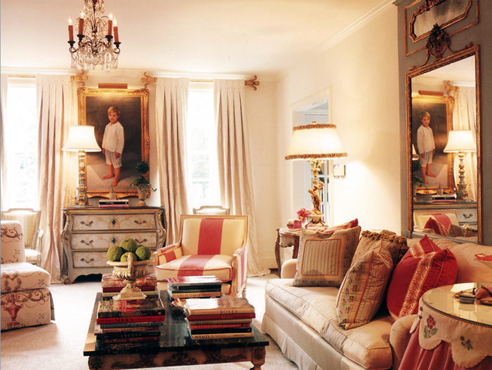
The original famous “Pink House” – lot of creams with accents of pink made up the formal living room. Throughout the house, Gregory used a cool gray as the secondary color. When first published in 2003, I thought this was one of the prettiest rooms I had ever seen – and I still feel that way today!
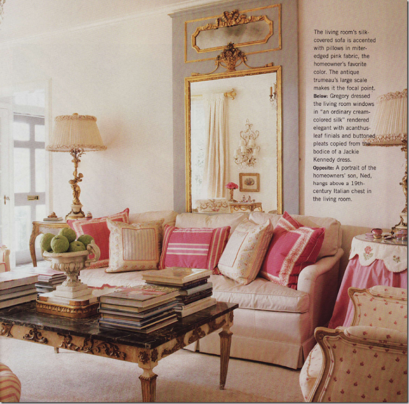
The living room – the blue-pink shows up in the silk pillows. The oversized antique French trumeau is the room’s focal point.
In the living room, the portrait of the owner’s son is flanked by lovely cream colored silk curtains. Notice how gorgeous the curtain rods are! Gregory said that the button pleats were modeled from the bodice of a Jacqueline Onassis dress!!
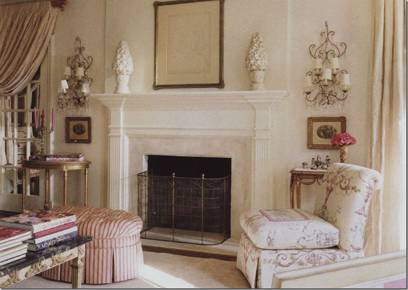
Across from the sofa is the fireplace with a pair of crystal sconces on each side. I adore the pink and cream striped ottoman and the ultra feminine fabric on the slipper chair.
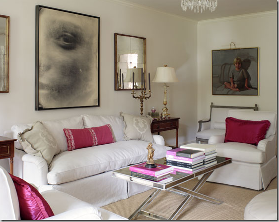
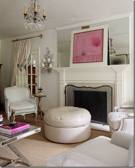
Today: the Pink House was redecorated by Suellen Gregory, as evidenced by these pictures on her web site. Gone are all the French pieces such as the trumeau, instead the room is now more cleaned lined with a heavy dose of glamour. The creams have been replaced with clear whites and the pinks are of a decidedly hotter variety. The French styled coffee table was replaced with a mirror-clad more contemporary piece and assorted bergeres were switched with club chairs. Notice how Gregory updated the sofa – there is a single bottom cushion and double back cushions that replaced the traditional three cushions of before. Notice too the dressmaker skirt that flows from the deck – a much updated look. Even the portrait of the son has become less traditional!
Painted wood frame chairs are now upholstered in white with chic nail head trim. The mantel has been mirrored, showcasing a contemporary piece of art done in pink – of course! Do you prefer the living room with the white decor or the pink decor? Hard to decide, I know!!!
The dining room, before, while the house was still all pink. The painted and gilded cane backed chairs are upholstered in silk and cream stripes and the floors are a wonderful, painted grey and white checked pattern. Just dreamy!!
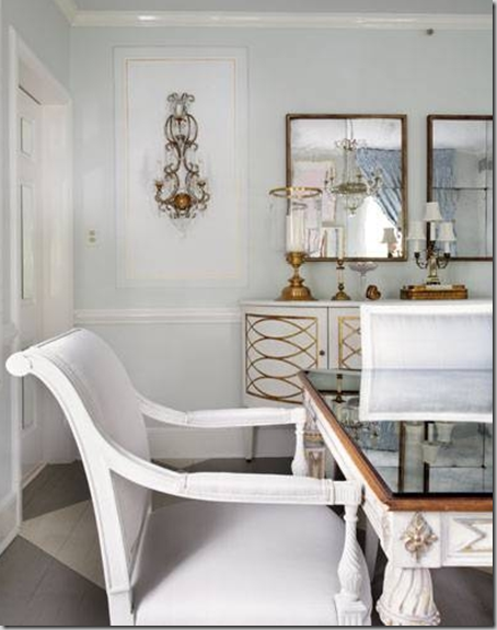
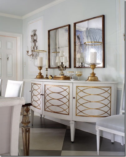
The dining room in the new white decor. The console is white with gilding. The chairs have been replaced. Mirrors replace art work. Just as in the living room, the dining room is more 40’s glam than the traditional French style before. The floors remain the same as does the table, although the top has been mirrored.
Another shot of the “white” dining room. Do you have a preference for the pink or the white decor? I really can’t say if I do myself. I love the pink decor, but the white is fabulous too.
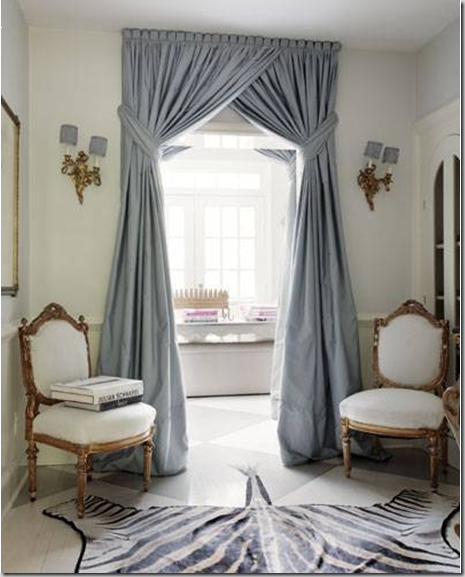
The entry hall as it originally was – in this room, Gregory chose to highlight the blue-gray color, instead of the blue-pink. The entry hall is long and is divided into sections. Through the second area, you can see the blue silk portieres that were used at the doorway. The slipper chairs were upholstered in the same fabric. I love how Gregory painted the handrail to match the floor boards! But the piece de resistance is the antique wood fragment, used over the portal, creating an arch effect – magnificent!
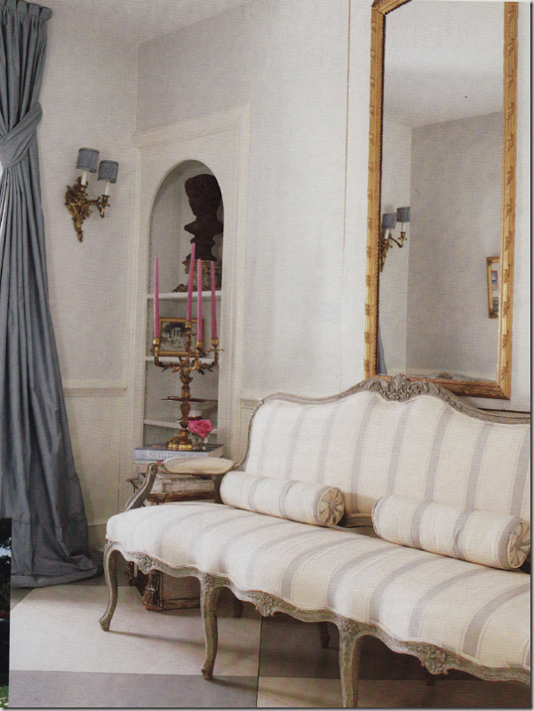
Across from the slipper chairs is this gorgeous antique French canape, in gray and white stripes. Notice the shelves are open here.
Today, the space has been updated – the slipper chairs are long gone, replaced with gilded chairs upholstered in white. A zebra rug finishes the updating. Note that the shelves now have arched doors closing them off. In this picture you can see the detailing of the portieres – Gregory does wonderful window treatments, as evidenced here. I love how they are tied back high up, rather than low, creating an excellent visual proportion and also notice the scalloping at the top of the curtains – all excellent ideas to file away and utilize on your own curtains one day.
For the Pink House’s family room, Gregory used a slipcovered sofa with pink trimmed pillows – pink gimp was used on the bergeres. The curtains are a softly colored pink and white ticking, held with beautiful antiqued mirrored tie backs. Above the sofa is another trumeau. Notice in the trumeau – the reflection of the luscious shades!!!
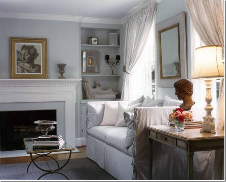
Today – as the “White House,” the pink pillows are replaced with white, as are the curtains. The walls are now the light blue-gray shade.
In the original Pink House design, he master bedroom was not done in pinks – instead it was all French and creams and whites and grays.
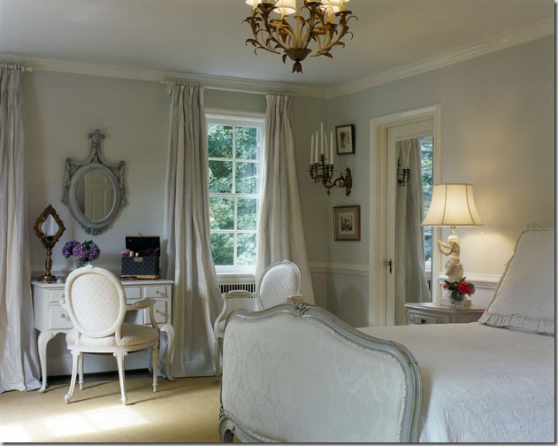
In the redecorating, the master bedroom was streamlined – the chair at the desk was changed as was the mirror. The bed linens are simplified without the duvet. I love the subtle gray and white striped fabric used for the curtains.
So, that is all the pictures of the Pink House, now the White House on Suellen Gregory’s web site, or is it????
While perusing the pictures, I found this one of a gorgeous paneled library filled with a beautiful pink silk damask fabric. But the painting over the fireplace looks familiar. Wait – it’s the same as the one in the “White House” living room! Could the house have been updated yet again? The touches of pink seen in the adjoining room give off even more tantalizing clues.
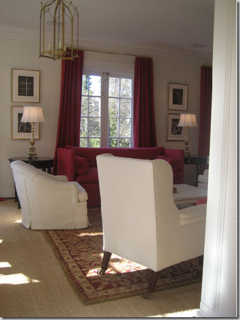
Might this room, with the deep pinks be the adjoining room to the library? The sofa does seem the same shape as the white slipcovered one…..
No, it can’t be the same house – this adjoining room isn’t the original Pink/White House’s living room. But it was fun for awhile to try to read the clues! As you all well know, I love to study houses and their decor and see the evolution of their rooms throughout the years. I become engrossed trying to figure out floor plans from pictures – how the rooms relate to each other. And so, after studying these three rooms above, I had to say, that no - it wasn’t the same Pink/White House at all, despite the same art work found in the paneled library. I must say, though, that this room designed by Gregory is one of my favorites on her web site. I love the lines of the twin sofas, the absence of the back cushions is so fresh looking and the long lumbar pillow is just the perfect accent. The two pieces of art or tapestry canvases flanking the doorway, are just gorgeous!!!! I love the gold mixed with the white – and notice the mirror-less frame over the mantel. Beautiful!!!!!!!! But wait…….the gilded chair in the gold damask, isn’t that the same chair upholstered in white in the entry hall of the Pink/White house????? The mystery continues……..
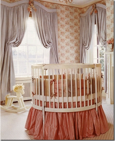
One of the prettiest nurseries in the world – this apricot and gray vision, with a toile wallpaper, patterned rug, and taffeta bedskirt was designed by Suellen Gregory. Notice the wonderfully shaped valance and how subtle the draperies are held back. Just beautiful!! Who wouldn’t want to be a baby in this room???
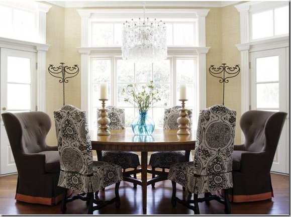
And finally, this dining room by Suellen Gregory features chocolate linen chairs from Coleen and Co. Coleen Rider, proprietress of Coleen and Co., also designed Gregory’s new web site.
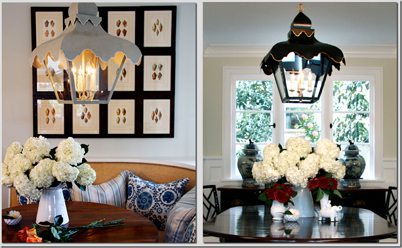 Coleen Rider’s fabulous tole tent lanterns, in gray and in black. They also come in wall sconces.
The pictures I’ve shown today are just a small taste of Suellen Gregory’s portfolio found on her newly designed web site. Be sure to visit it today to see all of her beautifully designed rooms, here. And also, be sure to visit Coleen Rider at Coleen and Co. To contact her web site development company, Creative and Company, please visit, here.


