When Stefan and I were in Miami, we stayed at the Soho Beach House in Miami Beach. It is the perfect place for those who want to stay in a quieter and less over the top hotel. It felt like we were staying in a friend's home. Before I show you the hotel itself, I thought I would start with our room and the chic hallways. Martin Brudnizki designed the hotel but I was told that all the special little touches were due to the owner, Nick Jones. The result is beach house meets English country mansion that somehow completely works.
There are gallery walls of art all over the hotel including in the elevator lobbies on each floor, above.
I loved the pale blue tufted leather walls in the elevators or lifts as the British like to call them.
Hallways are an often overlooked decorating opportunity. I absolutely loved the chic beachy look of the hotel hallways. This is definitely going in my beach house file for future use. It's so simple but perfect. The seagrass runner is actually inset which means there is no curled up edges to trip over. The pale grey and white tile set on the diagonal also refers back to the tile in Cecconi's.
Even the simple doors were perfect.
How fun would it be in a big beach house to number the doors so your guests can find their room easily?
Instead of blue like the hallways, our room was green.
The grey and white tile floor was cool and reminded me of nautical flags.
The details such as the hooks and leather umbrella stand were definitely English touches.
We had a big room that included a seating area, not that we sat much in Miami Beach!
The best part of the room was that it really did feel like you were staying in a very chic but comfortable home.
We loved the vintage suitcases under the bed!
They even supply a beach bag to use during your stay. Just wait until you see the pool and beach areas. Talk about chic!
The armoire was the closet.
I read that Nick Jones's favorite color is petrol blue which reminded me of the color of the old leather on these chairs.
You can either watch the view or the television.
We preferred the view which included the pool area and ocean. We also overlooked Cecconi's.
I loved that the chairs sat on a round seagrass rug.
The fabrics added to the English feeling in the room.
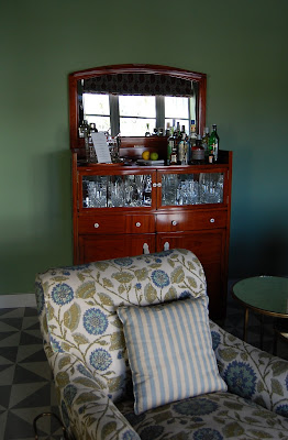
The bar was very chic.
You could even have someone come and make you drinks!
We had real crystal glasses in our room.
I loved the knobs on the bar.
This little chair was adorable.
I'm sure the tub in your room would be romantic if you were staying with your partner and not your friend!
The leather desk was chic too!
Another look at the comfy bed.
After dealing with the small bathroom on the cruiseship, we were most excited about the spacious bathroom!
Two sinks was a treat!
We both fell in love with the Cowshed Spa products!
We joked that the shower stall was as big as our entire bathroom on the cruiseship! I took a shower even when I didn't need to just because it was so fabulous! I especially loved the dry waiting area to the side. And even the WC, below, had its own sink.
As an architect and designer, Stefan and I were most impressed with all the details and special touches in our room and throughout the Soho Beach House. Just wait until you see the rest of the place!
Photos by Heather Clawson for Habitually Chic


