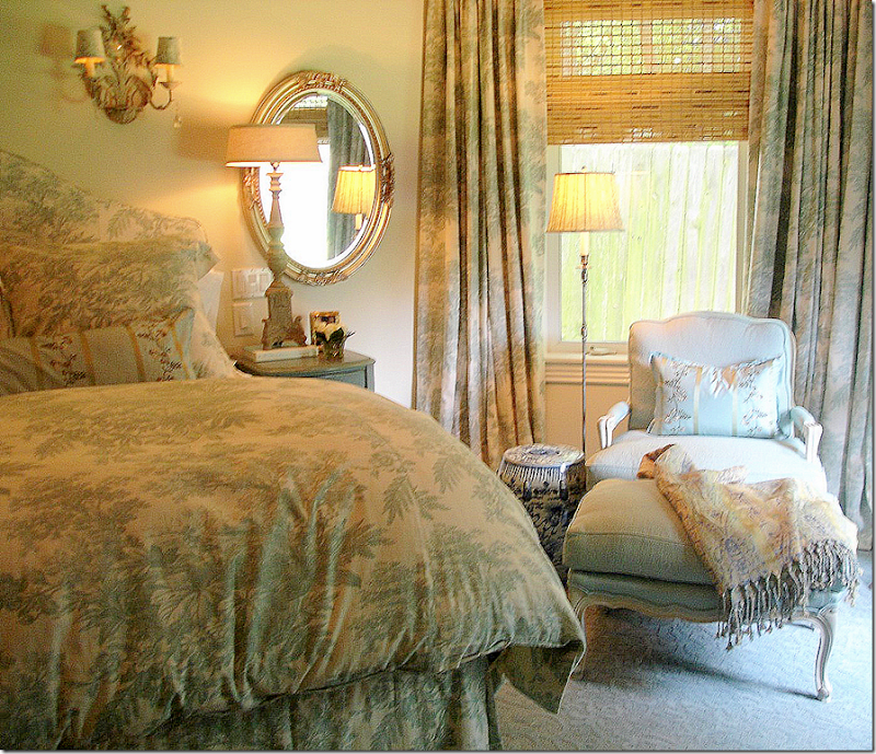
 The inspiration bedroom – teenager Allie wanted a bedroom that looked similar to this. Around four years ago, I had designed this bedroom on a budget, using mostly Pottery Barn merchandise.
Recently, I went to a client’s house and remembered that I had never taken pictures of her Allie’s, her teenaged daughter, bedroom. I worked on her bedroom a few years ago – this is the third bedroom I have decorated for the teenager. The first bedroom was when she was just out of the toddler stage, leaving behind her decorated nursery. I designed a room around a Waverly Toile in reds and golds. I KNOW you remember the toile ???? Everyone and his brother had it, or a version of it, from Waverly. I mixed it with, yes of course, red and cream checked fabrics. She had a pine headboard from Pier One and a mosquito netting over the bed. It was really a cute bedroom at the time. Even her doll beds were fitted with miniature toile spreads. That toile bedroom was supposed to last her until she left for college. Sure! Actually that bedroom was one of my first jobs as a designer.
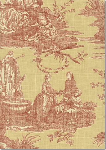 The famous Waverly toile in the red and gold colorway. Ugh!
After Allie and her parents moved to a new house, she continued to use the toile bedroom decor for a while, until she discovered Bombay Kids, when they opened a new store in the Rice Village. Allie insisted we redecorate her room ala Bombay Kids. Do you remember that awful crap they sold, pardon my French?? No wonder they went out of business! It was all purples and zebras and faux Indian Maharajah chic. I even had a skirted table made to match with a crystal beaded trim. Beautiful. Her carpet was a scrolled dark purple. It was all God-awful and thankfully she outgrew it quickly.
Bombay Kids – Faux Maharajah Chic
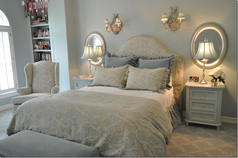
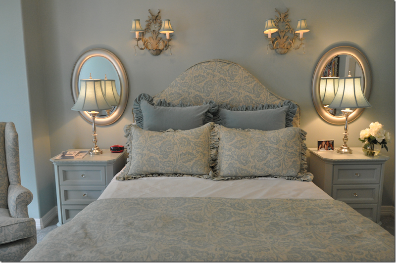
A few years earlier, I had decorated a bedroom on a budget for a mutual friend using mostly all Pottery Barn merchandise. Allie asked if I would recreate the bedroom, in feeling, for her. The two rooms do look similar, but there are several different important design elements. In the PB bedroom, the curtains in a large bay window were the focal point, but I absolutely could NOT persuade Allie’s mother to agree to curtains in her bedroom - a decision that still bothers me to this day. Conversely, while I could not get the PB bedroom owner to buy a two toned patterned carpet, Allie’s mother happily did, and the carpet adds so much to the room. Another main difference was the fabric, of course, and the wall color. We used a creamy gray in the PB bedroom, but Allie wanted a soft aqua on her walls. What Allie wants….
Allie’s bedroom, Version IV, if you count her nursery.
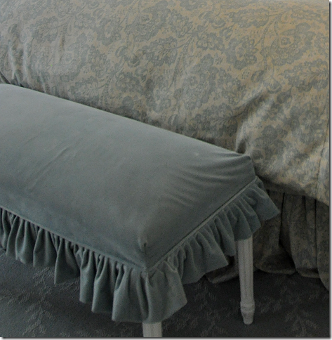
I used a Laura Ashley fabric from Kravet and a velvet for the pillows and the bench’s slipcover. The Laura Ashley fabric, a linen-cotton, is Briston Seaglass LA1301.324 and is very, very inexpensive. We had a strict budget for this room and nothing in it was too extravagant or expensive. For instance, the cute, white end tables came from Target – the Shabby Chic line. We paid next to nothing for them. The large wing chair, a hand me down from her parents, has been in her room for years and has been recovered at least three times now.
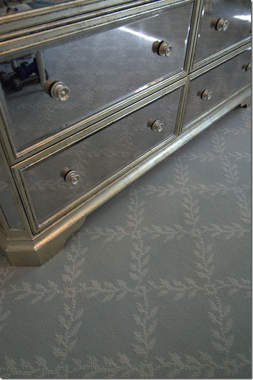
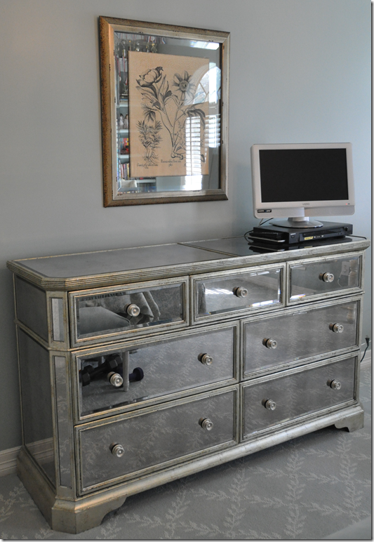 Across from the bed is a mirrored chest from Z Gallerie. We bought it on sale, but it’s usually $999.
We bought the bench from the Shabby Chic store in Austin and then made a slip cover for it out of the aqua velvet.
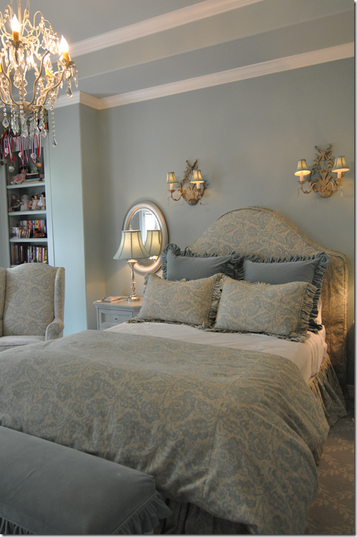 I luckily found six matching aqua lamp shades and two inexpensive lamps (but I can’t remember where they are from!) Allie wanted sconces just like in the PB bedroom, and she also wanted the oval mirrors flanking the bed. The sconces came from Indulge HERE. Another item Allie insisted on was a crystal chandelier. We bought this one online from one of those huge lighting stores and it was under $200.
The carpet is a trellis pattern in white and aqua – again, it was very, very reasonable. While not as inexpensive as plain pile carpet, the custom look is worth the minimal extra cost.
Allie needed something to put all her invitations and pictures on, so I made her a bulletin board. There was a large blank space between the bathroom and bedroom doors – and I had it made to fit that space. It is 5’ tall! If you look closely, you can see that it is tufted with buttons made out of the velvet fabric. I added a small pleated ruffle to dress it up and soften the edges. At first while it was still empty, the bulletin board looked odd – a huge blank piece of fabric hanging on the wall. But, Allie filled it up very fast. It has really helped keep her room neat and clean looking. Once she leaves for college, her mother can either take it down or hang a few prints on it, framed or not.
Here is the link for the Target Shabby Chic nightstands – HERE. And here is the link for the Z Gallerie mirrored chest – HERE. I’m sorry to say, but I absolutely have no idea what the paint color is! I”m sure it’s a Pratt and Lambert, but otherwise, I just can’t remember!!!

SOLVING A DESIGN PROBLEM:
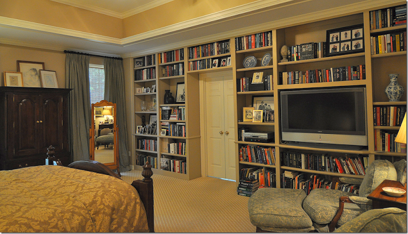
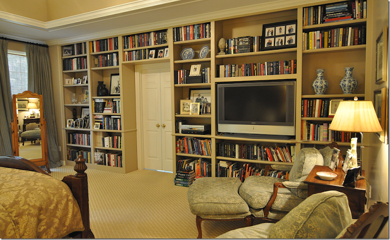 Bookshelves for a large bedroom.
We’ve discussed this issue many time before – what to do about those oversized bedrooms - huge, echoing, cavernous spaces that leave you cold? Alllie’s parents bedroom had that problem. Even with a large bed, an armoire, and two chairs and ottoman in a sitting area, the room still felt empty. What to do? My clients are voracious readers – in fact the entire family is. They have a million books, seriously, maybe even 2 million. Once they moved into their new house, all the built in bookshelves in the family room were quickly filled up. Next we added more shelves in the downstairs study. On the large second floor landing, we built a large floor to ceiling bookcase. Still, there were numerous leftover books needing to be shelved. The solution to the book problem and the empty bedroom problem was to add a floor to ceiling, wall to wall bookcase. I designed these shelves along the wall where the bathroom door is. And yes, the door is not centered on the wall – but there was nothing I could do about that – and in the end, it looks fine just the way it is. We finished this project over five years ago, and to do it again today, I would make the shelves thicker and fixed for a more up to date look. Once the shelves were built, the atmosphere in the room changed dramatically. It became a very cozy space – warm and friendly – despite its large size. This is a solution I would offer to anyone looking to fill up an oversized bedroom. Even if you don’t have a lot of books – you can always go to Half Priced Books and buy their Box of Books, filled with new hardbacks for just $25 – a steal of a deal.
Other things I did to cozy up the room was to add the two toned, trellis patterned carpet – in place of the cream Berber that was previously there. The client’s furniture was all pine – so, we restained most of the pieces dark brown which also helped ground the room. I added curtains and bamboo shades to the windows to further soften and warm up the room. The client used her own existing bedding in gold, while I brought in blue in the checked curtain fabric. The now stained dark armoire was short for these extra tall ceilings, but rather than buying a new one, I layered a collection of drawings on top of it to fill in the blank space. Looking at the room today, it’s hard to remember how it used to look before the bookshelves were added!
NOTE: THERE ARE THREE – YES, THREE – GIVEAWAYS COMING SOON!!! BE SURE TO WATCH AND ENTER. THE GIVEAWAYS ARE ALL REALLY GREAT ITEMS, I PROMISE YOU!!!!

