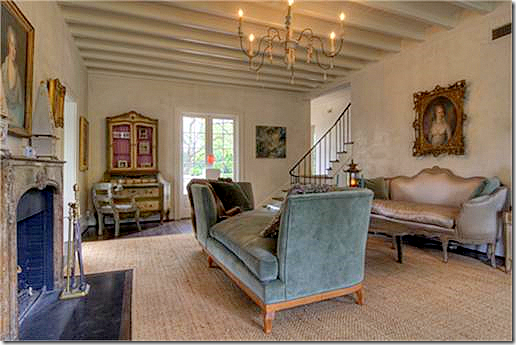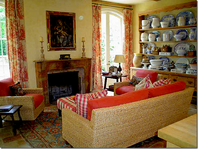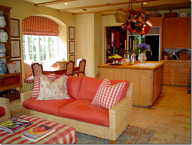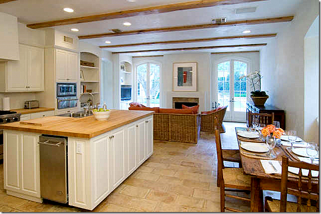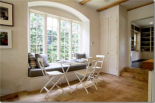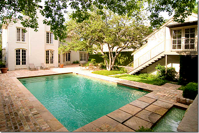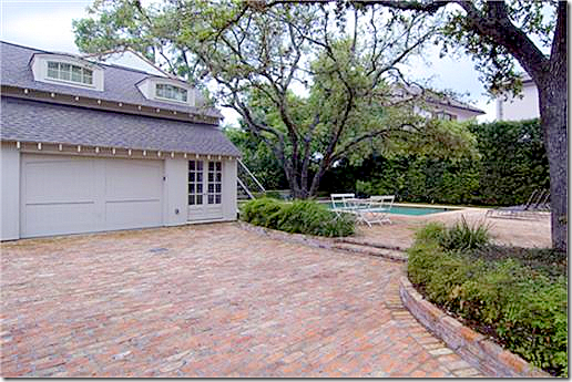
A while ago I wrote about The One Perfect House – or what I thought for me is the perfect house. This Perfect House was owned by Houston interior designer Carol Glasser, who as you all know, is someone whose taste and style I greatly admire. For years, Glasser lived in this wonderful house, small by some standards – 3196 sq ft – but perfectly sized for me. The house was built in 1935 and is located in River Oaks, Houston’s most exclusive neighborhood. Glasser of course changed the house over the years – adding onto it and redecorating it – making it that much more special with all her touches. When buying the house, Glasser overlooked its traditional Georgian facade, drawn instead to its beamed ceilings and iron railing on the stairs. She added a master bedroom suite and renovated the kitchen - increasing its size and turning it into a French styled keeping room with imported Provencal floor tiles. She added a wonderful back vestibule that lead to the romantic curving stairway. She landscaped the backyard creating a lush oasis with a swimming pool. The garage became an office with a bedroom above. The Perfect House was published in several national magazines and design books – and with each showing, Glasser tweaked it, changed it, and made it just a little bit better. A year or two prior to selling her house – she had totally remodeled it one more time. Her once warm yellow painted English styled living room now sported newly installed Venetian plaster walls. The wall to wall seagrass was removed, exposing the wood floors. The room became more streamlined, less cluttered, more French.
With each change Glasser made over the years, I hung onto each detail. I studied each photograph, comparing the before and after. What did she add? What did she sell? What did she change? The last metamorphism of The One Perfect House was my favorite – a peach and cream living room with an antique oushak rug along with gorgeous fabrics and curtains. I was stunned when after totally revamping the house, Glasser put it on the market. Whoa! I wanted it! I would have sold my left kidney to own the house, furnishings included - of course. But, alas, Carol didn’t need an extra kidney and I sadly watched as it quickly sold, wishing I was the lucky new owner. As I wrote in the original story The Story of One Perfect House HERE, I detailed how much Carol Glasser influenced my own design aesthetic. I started my own collection of blue and white transferware after seeing hers in magazines. She was first in town with Bennison fabrics and I followed her lead. She had seagrass before anyone else did. I bought a birdcage because she had one. I bought red toile because she did. I collected English smalls because she did. She bought Kenneth Turner candles, I bought Kenneth Turner candles. I also bought red paisleys, just like Glasser. I could go on and on how I tried to clone my aesthetic into in hers, rather unsuccessfully I’m afraid because true genius is not so easily stolen. I can’t tell you how many times I drove down her street at barely a crawl, hoping for what? For her to run outside and see me and invite me in for coffee and a tour???? hehe Probably. I don’t know. I was a crazed stalker who deserved to be arrested!
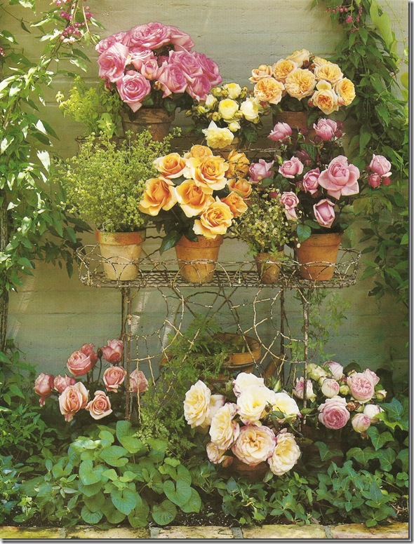
Everything she touches is a visual treat. Roses in Glasser’s back yard.
Glasser’s Perfect House was sold to a single woman with impeccable style herself – though her aesthetic was totally different than Glasser’s. The new owner stripped the house bare, the walls were painted white, and the furnishings were as sparse as the accessories. I know all this because the new owner decided to sell The Perfect House just a few years later and the pictures of the house were put on the internet. Again, while I screamed “MINE” – I watched as yet another new owner staked claim to my dream house.
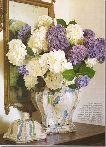
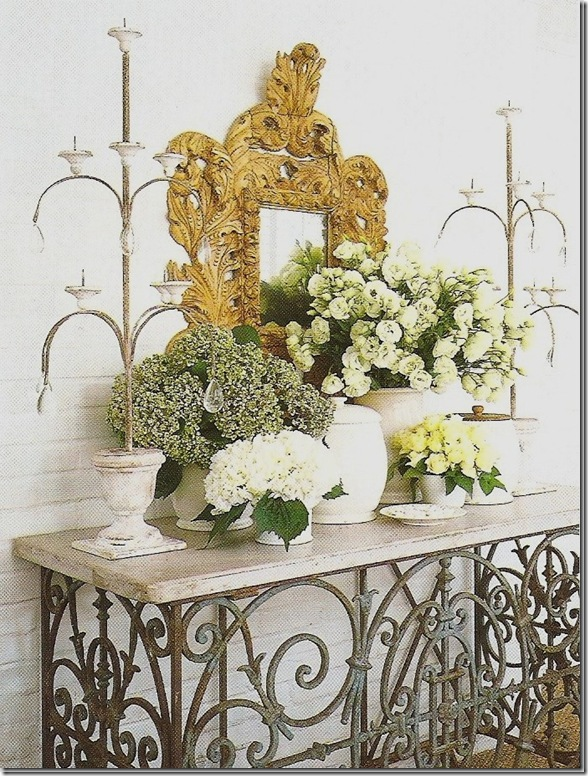
Entry Hall Vignette #1
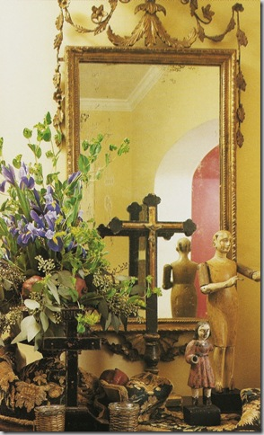
Entry Hall Vignette #2
Now, I wonder if it is cursed? The third owner has recently put it up for sale, yet again, and the pictures are, yet again, made public on the internet. Are they just trying to torture me? It’s like they are saying, “here’s your chance AGAIN, don’t blow it this time!” Ben thinks it’s funny. I wonder how long it will be on the market this time? Should I pretend I can afford it just to walk through it with a realtor? Do realtors do credit checks before they let you to traipse all over properties you can’t afford?
But seriously, this gives people like you and me another opportunity to study design. How often can one can see the evolution of a house with three owners, each with their own certain style? I wonder will the new owner change the contemporary mantels back to their rightful traditional style? It would s0 hospitable if the new owner would let me in to photograph all her changes!!! But, I doubt that will happen. Maybe Owner #4 will quickly sell it too. Until then, here again, is The One Perfect House. First, I’ll recap the changes that Glasser made to her house over the years. (Because really, I can never get enough of looking at those wonderful photographs!) Next, I’ll show each room first under Glasser, then under owner #2, and now under owner #3. And no, I STILL cannot afford to buy this wonderful house, although I really do belong there and deserve to move in myself (if only my accountant and husband agreed!)
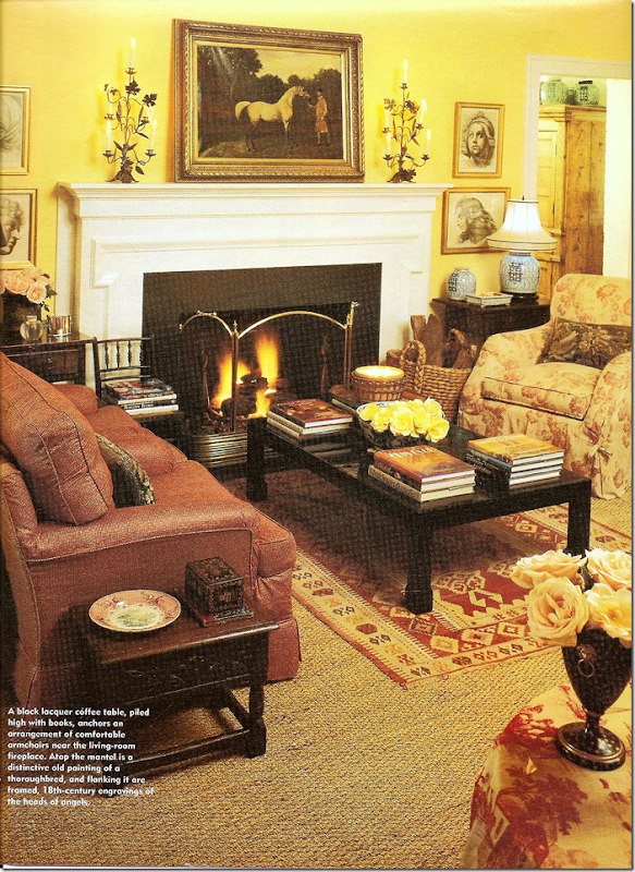
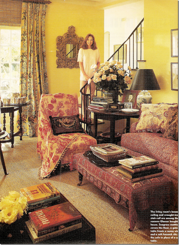
A very early view of the living room – yellow walls, blue and white striped dhurri rug (wow – so many years before Somethings Gotta Give!!), red toile and paisley, lacquered black coffee table, and wood mantel.
Later: subtle changes with installation of seagrass topped with an accent rug, painting over the fireplace. English country manor style decorating at its best.
Same photoshoot as above: Glasser stands on her romantic iron railed, curving stairway. Lots of warm reds and yellows – veddy English inspired. I remember drooling over this photoshoot – those roses!! That toile perfectly draped. That smile! Hey, I’d be smiling too if that was me standing there.
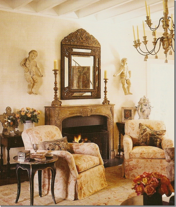
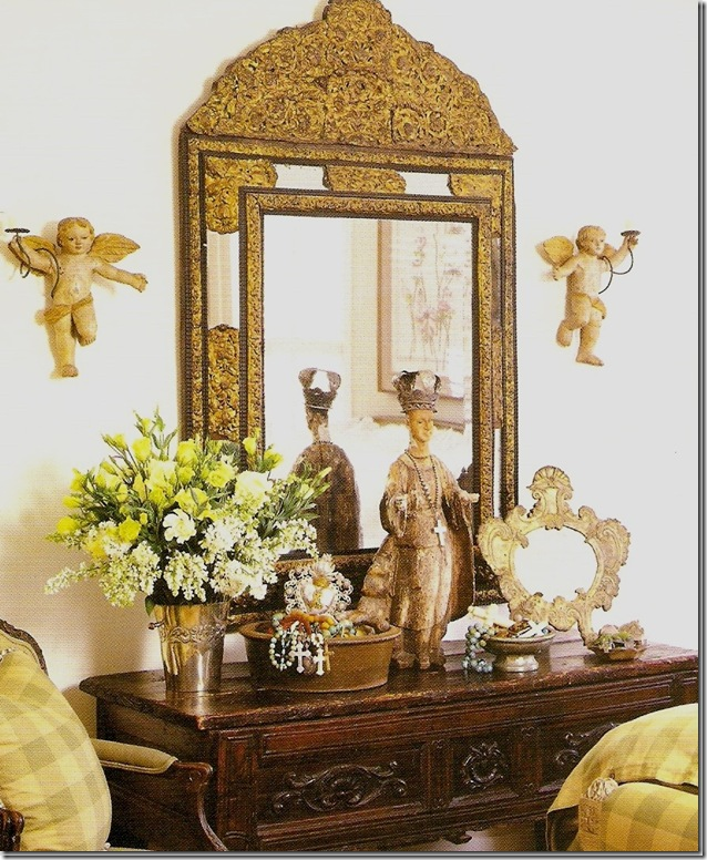
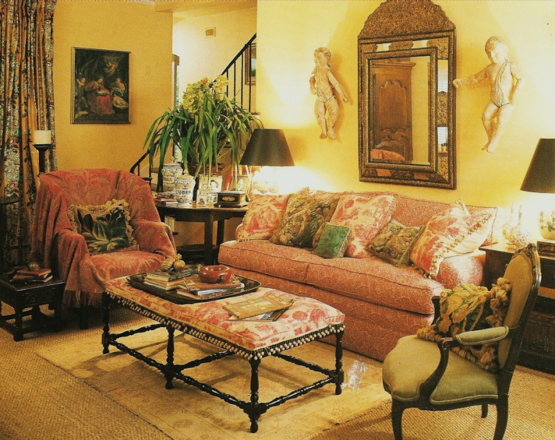 Later: more subtle changes – the bench gets upholstered in antique toile, the faded oushak rug is added, the mirror replaces artwork, and the putti make an appearance – years before anyone was buying them. Notice how the draped toile in the previous picture was used on the bench – along with the trim. Leftovers were used for pillows.
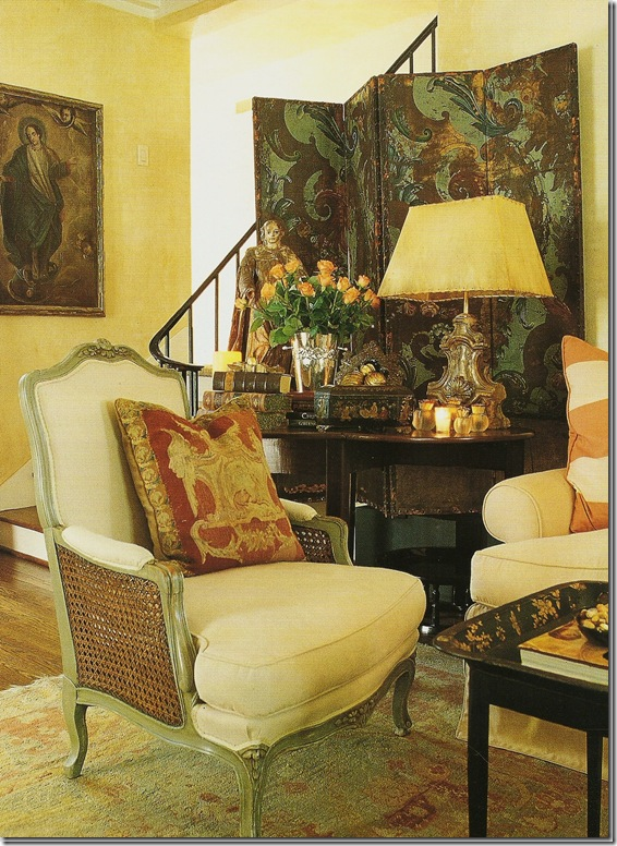
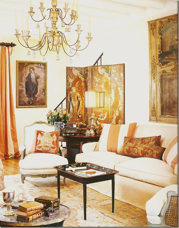
The last redecorating: cream walls, seagrass removed, antique oushak added, peach and cream colored fabrics. – no more red. Beaumont and Fletcher toile fabric covers the two armchairs while striped curtains replace the former chintz ones.
Close up of painted French chairs and screen.
Gorgeous – just gorgeous!!!! Notice the wood mantel has been replaced with an antique marble mantle (not sure if this is marble.) The mirror makes another appearance here, along with the putti. The beams are so pretty.
A French trumeau now hangs over the sofa. The look is more clean lined, less cluttered- more French feeling than English. Notice the gorgeous Italian chandelier. Glasser uses real candles in her lighting fixture.
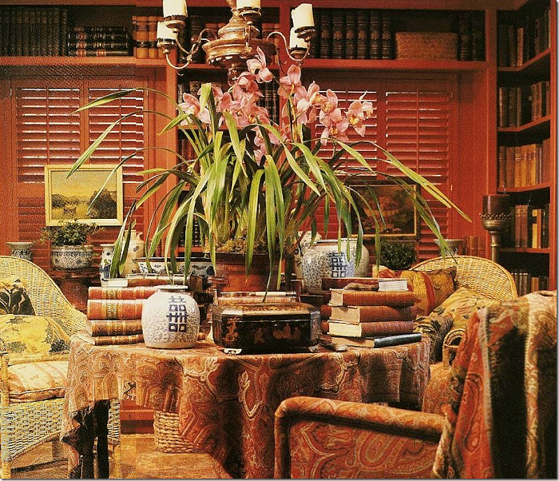
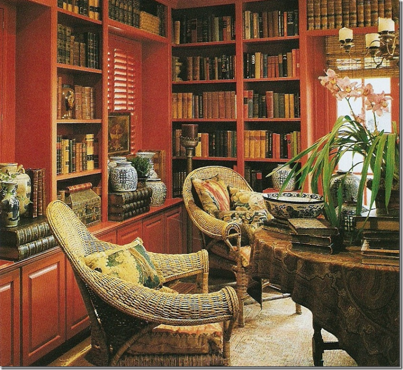 The dining room/library remains red throughout Glasser’s time in the house. For each photoshoot, the chairs and table cloths are swapped out to create new interest. Here wonderful wicker chairs surround a paisley covered gate leg. Yes, Carol used gate legs so I used gate legs. God, this is so embarrassing to admit how much I copied her!!! Glasser’s pillows are almost always antique tapestries. Yes. I use those too – though not as much as she does.
Another view – Glasser always uses antique accessories only – stacks of wonderful old books, boxes, blue and white porcelains, baskets, tapestry pillows – all the things that made her house warm, cozy, livable, and uniquely Glasser’s.
Later, the paisley was replaced with ticking. Santos became more important in her decor.
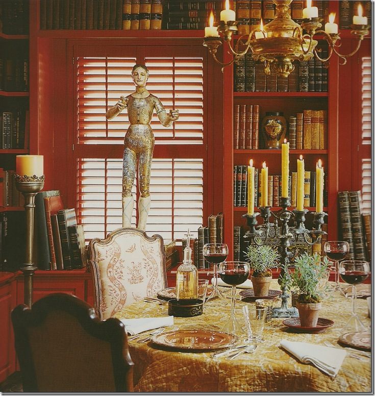 For this later photoshoot, chairs from the kitchen were used along with a French quilt. The red or persimmon walls were a constant.
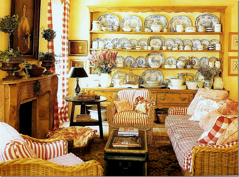
In the Keeping Room – she used wicker furniture, toiles, stripes, and blue and white transferware. This room was inspirational to many who loved her collection of transferware, myself included.
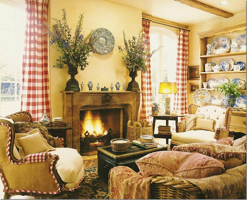 At this photoshoot, French chairs with burlap (before it was trendy) were used instead of the wicker.
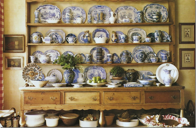
Glasser’s signature look that inspired so many collectors. The famous Welsh 10’ long dresser.
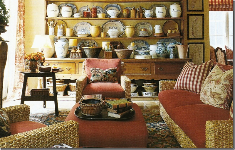 At this more recent photoshoot, the wicker was moved to the sunroom and was replaced with this set of more streamlined furniture. The blue and white transferware was mostly put away (prompting me to do the same! I’m such a terrible copy cat!) The check curtains have been replaced with toile. And the reds look softer, more persimmon – perhaps to blend in with the peach in the living room?
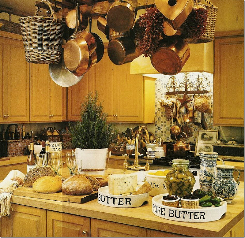 Glasser collected the real deal – antique creamware before anyone else. We all bought reproductions.
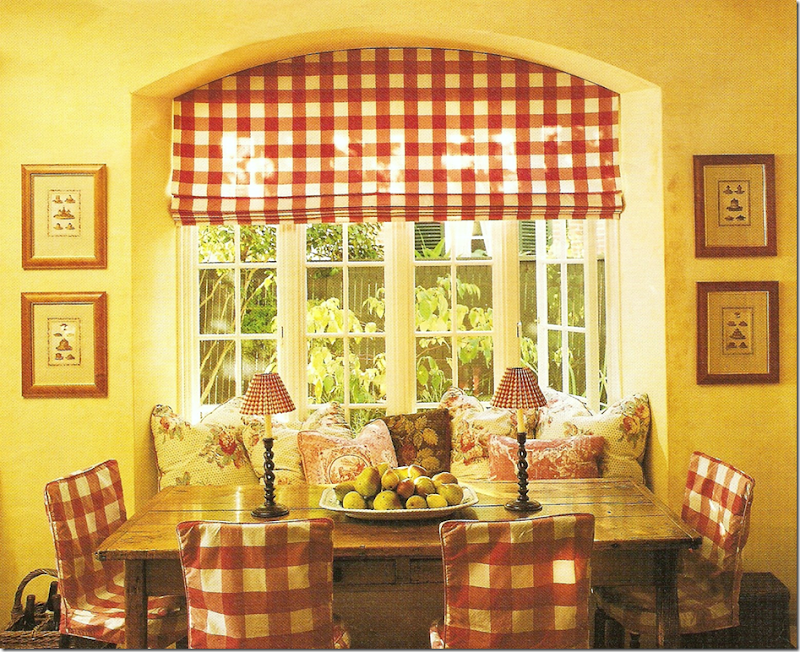
Colefax and Fowler chintz and red toiles and checks – an early version of her breakfast area.
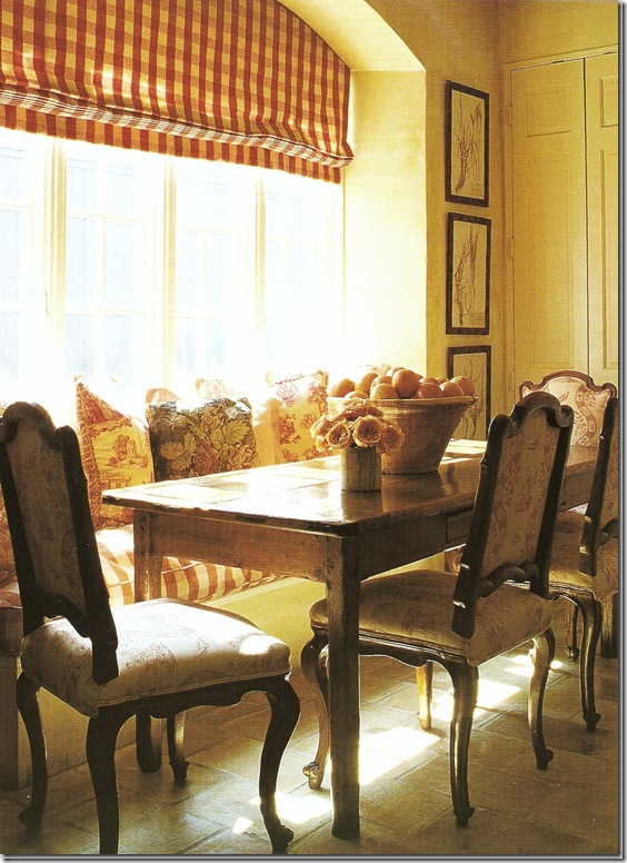 Later, more sophisticated French antique chairs with Bennison toile replace the slipcovered ones. Although the shade looks the same, I wonder if it’s different than before, again more orange than red.
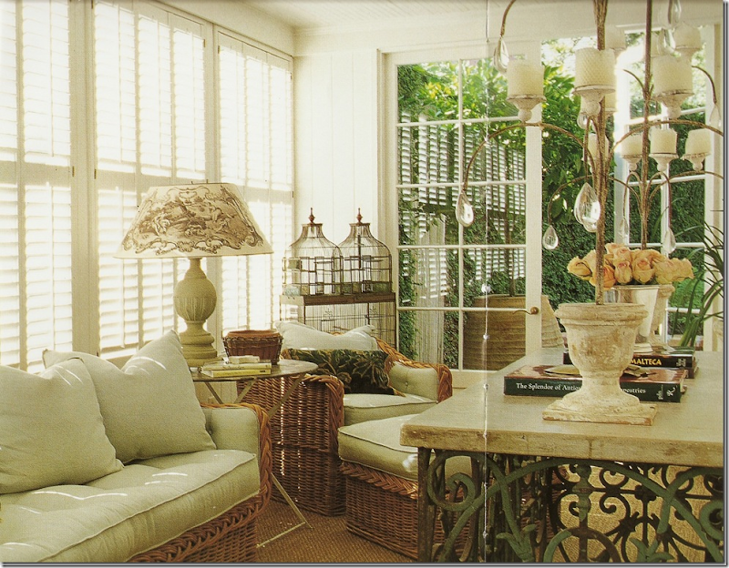 The sun room with the older wicker furniture now in gray. I adore that lampshade! I copied that too!
The sunroom – with all the beautiful white pottery and antique iron buffet. This mirror was moved here from her bedroom.

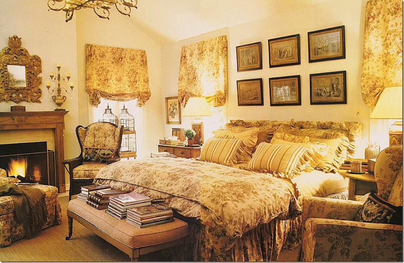
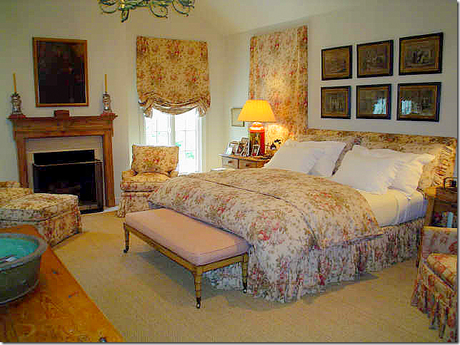
The bedroom – all Bennison – Roses pattern. This room stayed pretty much the same with just a few changes over the years. Why mess with perfection? And yes, I used this pattern on some chairs in my living room. Yikes! I never realized how many ideas I stole from Glasser! Should I send her a commission?
Later Glasser style. She has such a flair for accessories. Just beautiful. I believe this picture was taken in Glasser’s guest room.
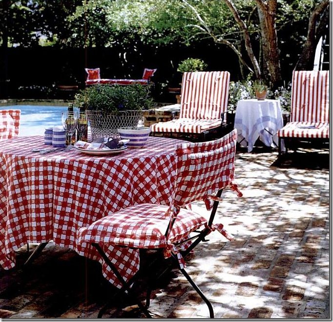
Glasser’s backyard – ready for a photoshoot.
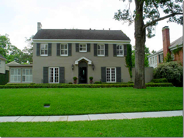
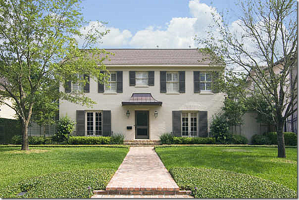
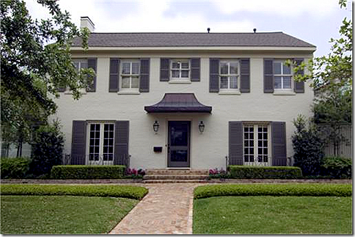
One Perfect House – Three Owners:
Glasser: The exterior was always rather simple. Not much landscaping out front and no center sidewalk. I would have changed the sunroom – either added a pitched roof or another story. Not sure – I’d hire either Kurt Aichler or Kirby Mears for their opinion!!
Owner #2 – a new brick walkway was added. New paint color. New metal awning over the front door. New lighter roof. New trees. New landscaping around the front windows. Prettier?!!
Owner #3 – everything remains the same as under owner #2, just more grown out landscaping.
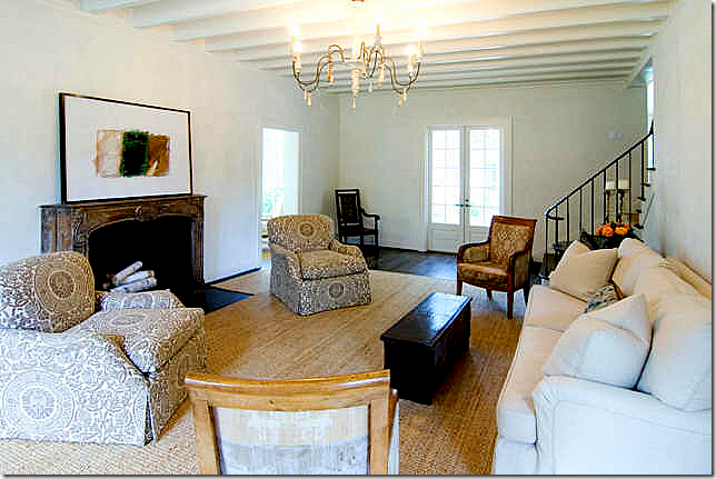
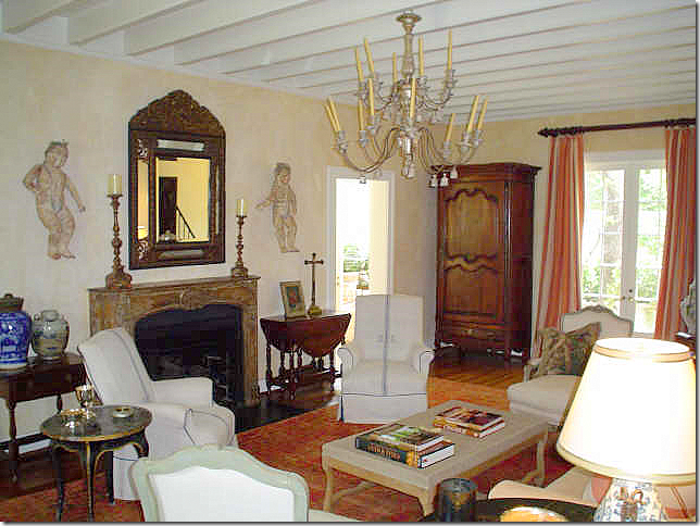 Glasser: Living Room: this photo always puzzled me – where are the Beaumont and Fletcher toile chairs? I do love these armchairs with the trendy antique linens, but I do miss the peach toile chairs. I also miss the small tray coffee table shown in the professional pictures.
Owner #2 – totally different. No curtains, no accessories and the walls are white white. I love the seagrass, the upholstered chairs, the linen sofa, the lighting fixture. It just looks a little too bare for my tastes.
Owner #3 – I really like this. The seagrass stayed. I like the floating chaise. It looks pretty and restful to me.
Glasser: Sunroom. Again, different from the photoshoot. The lampshades are changed, the buffet is different. It just shows how wonderful professional photographers are compared to real estate photographers!
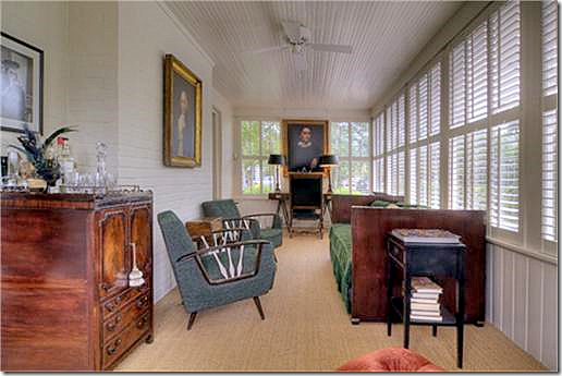 Owner #3: Sunroom. Not my favorite style of antique furniture. I like the portraits and the seagrass.
Owner #3 – the entrance hall looking into the dining room. This is the only picture of the entrance hall. I never realized the doorway into the dining room was arched.
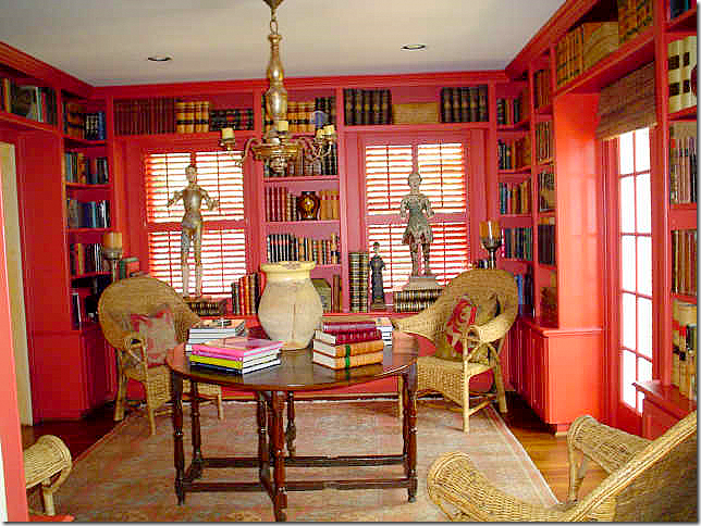 Glasser: Of course her dining room is red, but I wonder if she maybe toned down the red and made it a little more orange to go along with newly peach colored living room? Not sure. I suppose this is how she kept it normally when there weren’t photographers around: the wicker chairs pushed to the corners, the gate leg table sits like a center hall table. dressed just with books and a yelloware pot?
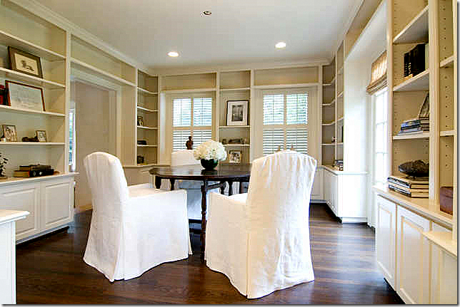 Owner #2 – the red is now gone, replaced with the white or bone colored paint. It appears the floors were also refinished with a darker stain. The sparseness is evident here with the shelves – they look barely filled. I love the chairs – elegantly slipped in white linen. No chandelier – yet it looks like there might have been one, judging from the hole in the ceiling. I wonder if this table stayed with the house? It looks remarkably like Glassers. The kitchen is off to the left.
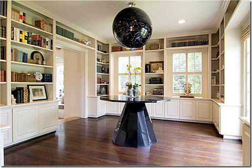 Owner #3 – is that a marble globe/light fixture? Never saw anything like that before. And the marble table is too contemporary IMHO for the house. Here the room looks more like an entry hall than a dining room or library.
Glasser: Keeping Room. Awwww. Love. Love the toile curtains. I noticed the ottoman is now checked – not solid. This is such a charming room.
Glasser: view to the kitchen and breakfast area.
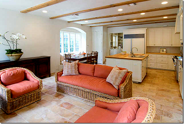 Owner #2 - the room was painted lighter, whiter. It’s so sparse – it almost makes me wonder if this house was staged for the real estate photographs? And did the owner buy Glasser’s set of wicker furniture? Hmmm.
Owner #3 – I like the slipcovered sofa. This room really looks completely different than it during Glasser’s time or Owner #2. Look at the mantel!! Whoa – when was that changed and why? It’s so contemporary!!
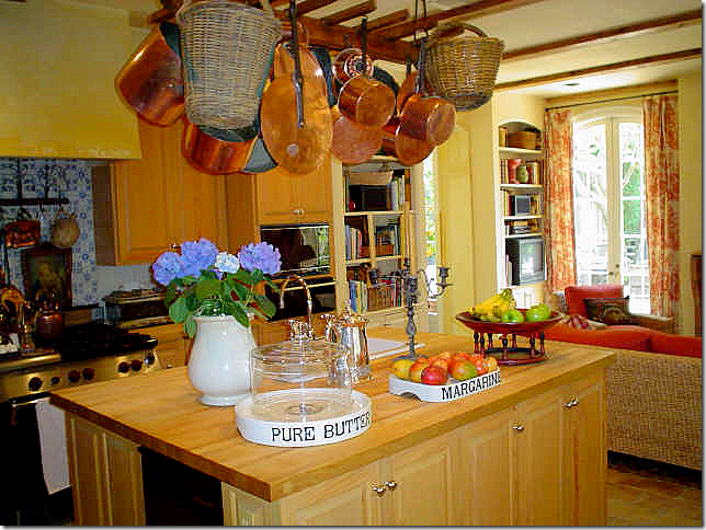 Glasser: the kitchen was not my favorite room – I don’t care for butcher block, or the cabinet stain. But I adore all her kitchen accessories.
Owner #2 – ok, she is the one who redid mantel. I think that is a huge mistake.
Owner #3 – I really do like that sofa!
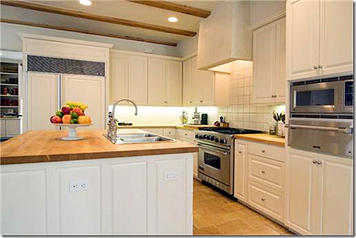 Owner #3 – here you can see all the new appliances and the new back splash that Owner #2 put in. Gone is the beautiful blue and white tiles that Glasser u.
Owner #3 – used a simple garden style table and chairs. I like the colors, the whites and grays.
Glasser: the beautiful all Bennison Roses bedroom.
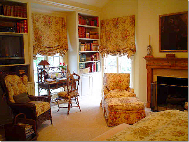 Glasser – across from the bed, the charming bamboo desk. Glasser really helped popularize this Bennison pattern. After her bedroom was published, there were several other bedrooms shown in magazines with all Bennison Roses bedrooms too!
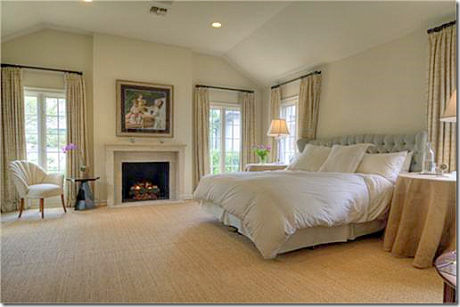
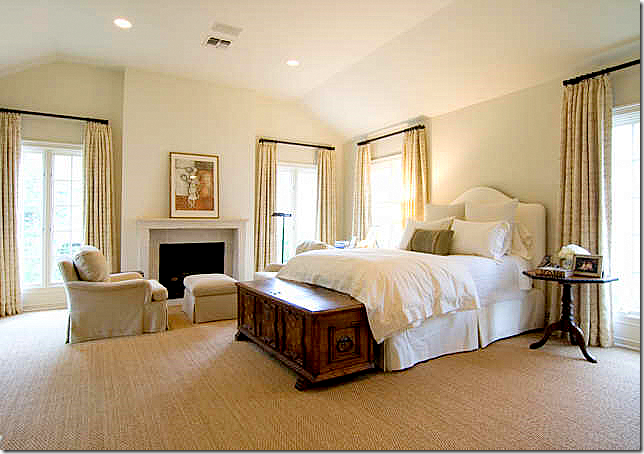 Owner #2 – it looks like she used a Rose Tarlow linen for the windows. I miss the curtains in other rooms of the house. The mantel was changed here too. This room is so pretty and again so different from Glasser.
Owner #3 – it looks like these owners used the same curtains as #2. I think the living room and the bedroom are both the prettiest rooms in #3’s version. I love their end tables and headboard. The bedroom is such a beautiful space with all the windows and the fireplace. Of course, Glasser added this room onto the house.
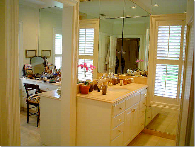
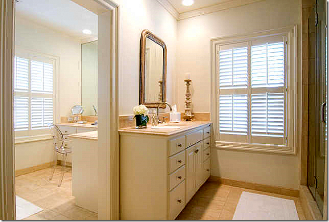
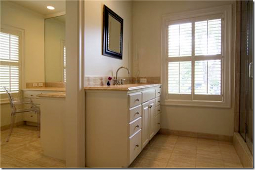
Glasser’s master bathroom. I would love to be able to study her vanity! I bet she has the most beautiful smalls from England and France. You can see her horn cup collection on the man’s side of the bathroom.
Owner #2 took out the mirrors and replaced them with a Louis Philippe antique mirror and one candlestick for accent. I do like this much better than the wall to wall mirrors that were there before.
Owner #3 – again, a small mirror – not quite as graceful as the Louis Philippe. Notice she uses a ghost chair also.
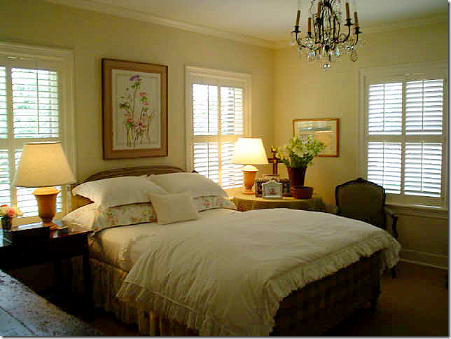 Glasser: the house only has two bedrooms and two and 1/2 baths. Another bedroom is upstairs in the garage. This is a rare picture of Glasser’s second bedroom, rarely photographed before. I think the French chair was once in her living room.
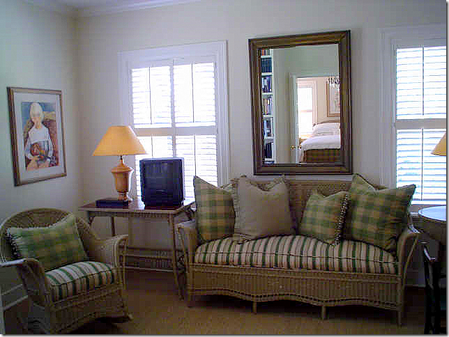 Glasser: This looks like a landing area outside the guest bedroom. I love this set of antique looking wicker.
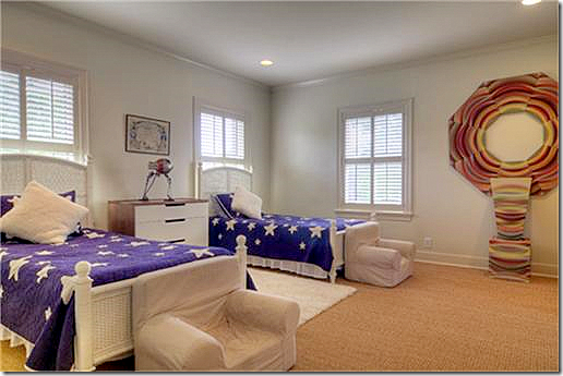
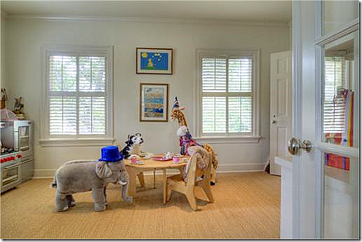
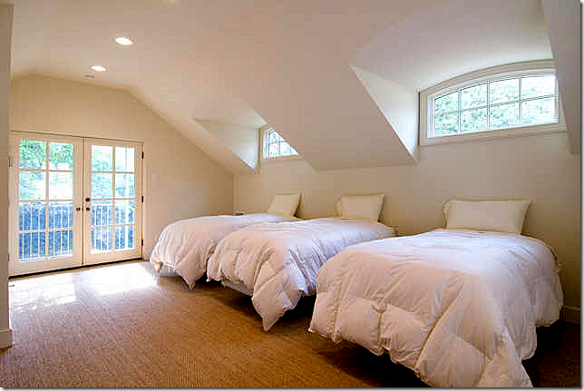
Owner #3 – what a darling playroom. This must be the extra landing space upstairs.
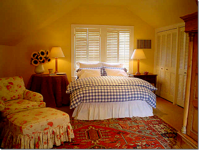 Glasser: the space above the garage was used as a guest bedroom. Never published before.
Glasser: her backyard was as wonderfully designed as her house. I notice the iron buffet that was in the sunroom is now between the two French doors.
Owner #2 – the lighter paint certainly makes the backyard look different. The romantic back door now sports an awning. If I moved here, I would probably add onto the house above the sunroom. I always thought that needed to be done to balance out the exterior.
Glasser: another photograph of her back yard for the photographer. Look at the roses climbing up the by the French doors.
Owner #2 – you can see the garage with the bunk room above it here. I wonder if she added the spa?
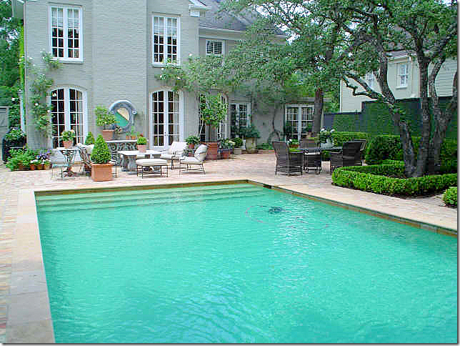
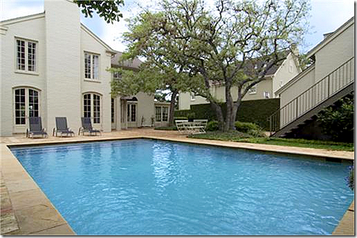 Owner #3 – the pool looks a prettier color here – more blue, less green. I miss Glasser's backyard furniture.
Owner #3 – view of the pool again.
Owner #3 – a view of the remodeled garage. It looks like there is another room in the garage on the ground floor.
I hope you have enjoyed this latest chapter in The One Perfect House and I hope the new owners will appreciate this house and possibly stay longer than a year or two! I know I would.
To read the HAR report on this house, go HERE. To read my original story on Carol Glasser and The Story of One Perfect House, go HERE.
