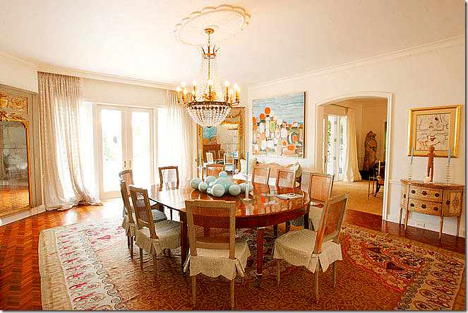
New Orleans interior designer Gerrie Bremermann has made a career out of designing French interiors – heavy on the use of antiques. Her designs are timeless and classic – a Bremermann room doesn’t date. To be sure, it is her use of antiques that help to make her designs everlasting. Her rooms are sophisticated, yet they are also warm and cozy, a rare combination that is hard to achieve. She prefers using natural and relaxed fabrics such as linens and cottons. She loves painted furniture, crystal chandeliers and sconces, trumeaus, and wonderful full and luscious silk curtains. She usually works with a palette of creams, ivories, golds, and caramels, because “they are timeless and they work.” Bremermann certainly has her own recognizable look. A self taught designer, she leans towards the dainty and feminine French antiques of the 18th century although lately she has been using more Swedish antiques than before. She is tops in the field and has been in the business long enough that she is hired by second and third generation clients. Bremermann is a grande dame with impeccable style and taste. She is known best for lightening up New Orleans’ heavily gilded aesthetic. Preferring to design more casual interiors, Bremermann set up shop on trendy Magazine Street leaving behind the old guard on Royal Street in the French Quarter.
But, last year Bremermann stirred things up a bit. A house she designed in Palm Beach landed on the pages of the late Southern Accents and it was a huge departure from her usual designs. Yes, Bremermann has been gravitating towards more lighter interiors: a few recent projects leaned more to the airy Swedish style than the French. Still, the Palm Beach house was so light, so white, so fresh and youthful – it seemed to be the work of a 30s-something designer, rather than one with Bremermann’s experience. The walls of the beach house were stark white, something that her fans weren’t accustomed to seeing. The living room had a long, Belgian inspired slipped covered sofa – Belgian? Bremermann? Pictures of the house were splashed all over the design blogosphere – especially pictures of the beautiful living room with its gold and pink accents. The other sitting room was also highly praised for its gray and cream color scheme and the Amanda Talley abstract painting over the fireplace. The dining room was notable for two oversized mirrors standing diagonally in the corners. The house was photographed by the hugely accomplished Tria Giovan HERE.
The Palm Beach house remains the last published job for Bremermann so followers of her work are left wondering if this new style will be seen again? More amazing is that at a time when most in her shoes would be thinking of retirement, Bremermann pulled out all the stops to create something so remarkably new and different. It will be interesting to see where she takes us next!
Today, I’ll show first a quick look at her older work, then we’ll look at her latest, the Palm Beach house. I’ll compare the real estate photographs of the Palm Beach house with the Southern Accents photographs. Yes, the Palm Beach house is up for sale. I love, love, love to see real estate photos of houses that have been published. I think it’s fascinating to see the difference between the two. Comparing the two photographers is really a study in how truly talented the professional design photographers are – their pictures are works of art. By contrast, the real estate photos are amateurish and do nothing to make the house look inviting. How they ever sell a house based on those photos, I’ll never understand.
An early example of Bremermann’s work. This room is pure Bremermann – timeless, classic, inviting, warm, sophisticated yet inviting. Her love of French antiques is shown here with the multiples of chairs. Bremermann loves using French chairs – because you can easily move them around the room as needed for guests and conversation. The room’s color palette is typical of Bremermann – golds, ivories, and creams. Beautiful antique oushak rug covers the hardwoods. The luscious ballgown silk curtains are a trademark. I would be willing to lay odds that the owners have kept this room exactly as is all these years later.
Another favorite of mine is this dining room with the oversized antique Italian light fixture – Bremermann purposely used the large chandelier because it brings a playful, youthful element to the room. The scalloped slipcovered seats also help alleviate any seriousness in the decor. Again, gorgeous antiques and gorgeous curtains. The painted, cane chairs are devine!
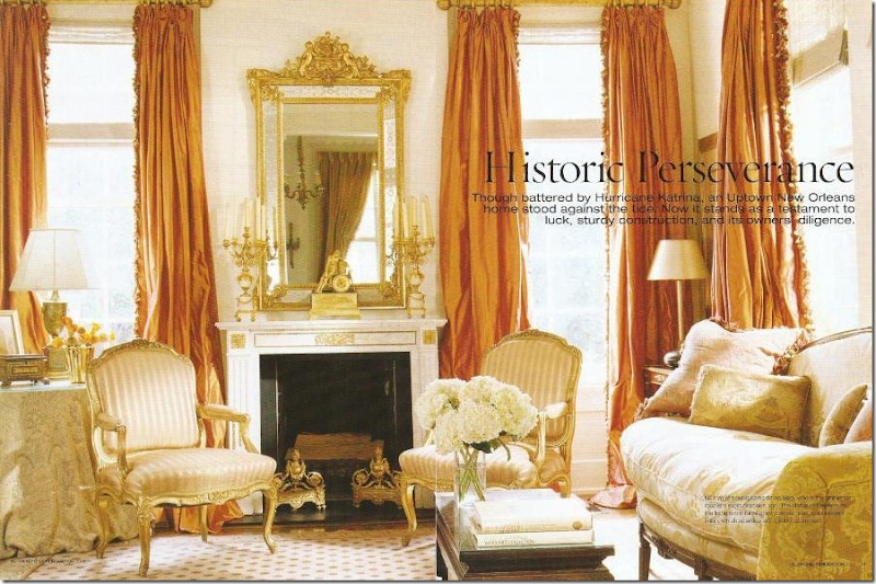
Another personal favorite – this living room in New Orleans is more dressy than most of Bremermann’s interiors. The curtains are to die for and have been copied over and over again. Bremermann has a formula for her curtains and she once described it in a magazine article. I dutifully wrote it down and it helped me formulate my own curtain formula! The key to the lushness is using three widths of fabric.

The Palm Beach House – Real Estate VS Professional Photography:
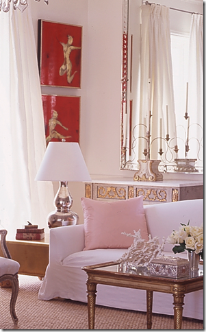
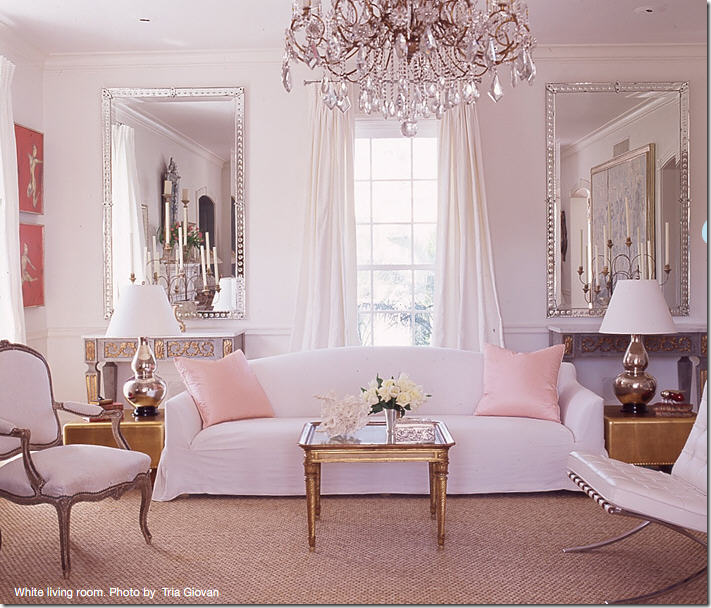
The Palm Beach house – the latest publicized work by Gerrie Bremermann. A clear departure for her: here she uses a long, tight cushion, slipcovered Belgian inspired sofa. It is beyond gorgeous - swoonable. Two gold leaf contemporary tables flank it, while an antique gold leaf table is used as a coffee table. The two painted gilt French consoles along the back wall are showstoppers, while the mirrors with their contemporary lines frame the entire vignette. The crystal chandelier looks gorgeous here. A simple seagrass covers the floors – it’s a beach house after all! Notice how Bremermann mixed the gold with the silver. White silk taffetta curtains hang off simple pewter rods. The two pink pillows give a pop of color.
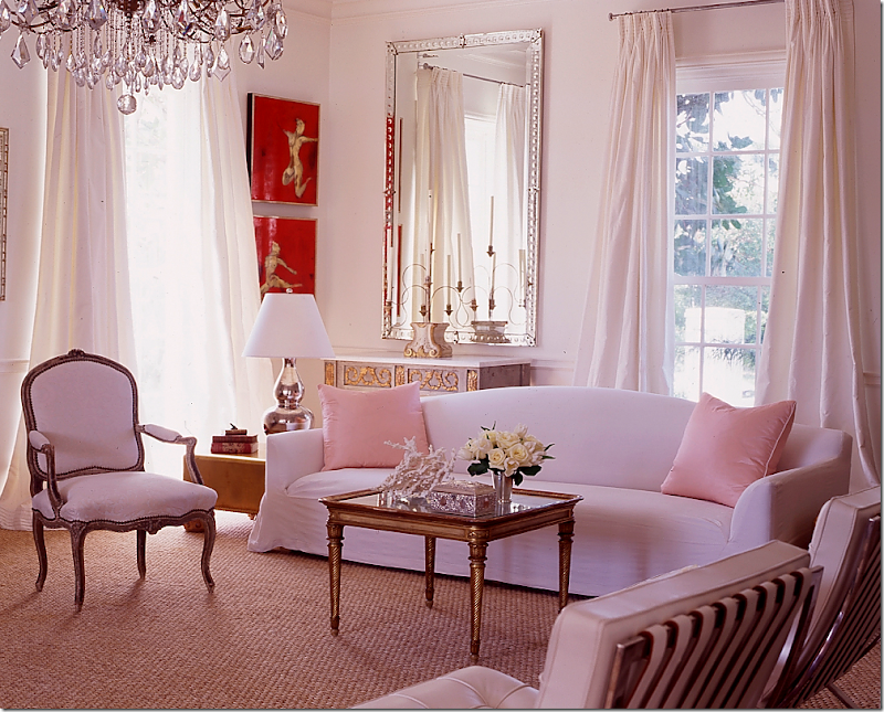
Another view – this house was such a stunner for devotees of Bremermann’s work. The stark white is unusual for her, as is the contemporary furniture she mixed in with all the antiques. The look is sophisticated in a youthful way. I imagine a young couple living here with their small children. It’s fresh, hip, and slightly trendy. Photos by Tria Giovan.
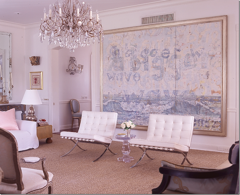
Another view – here you see the oversized oil painting by Nicole Charbonnet that takes up the wall. The painting introduces another pastel color, blue, into the room. I love the white leather on the Mies Van der Rohe Barcelona chairs and the acrylic table. Beautiful sconces peek in the hallway where a French chair wears more light blue. It’s a shame the a/c vent couldn’t be moved! This is surely the first time I’ve ever seen Bremermann use the Barcelona chair.
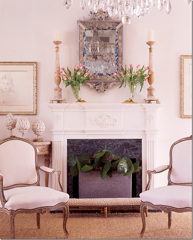
And, across from the Charbonnet painting is the fireplace with a stunning Venetian mirror over it. Notice the pair of antique painted French chairs are across from the pair of the contemporary Barcelona chairs. Notice how in all the pictures of the this room, Giovan took tight shots – creating vignettes with her lens. Now, do you want to see what this room really looks like – away from the lens of the fabulous Tria Giovan who took the pictures for Southern Accents???? Look below:
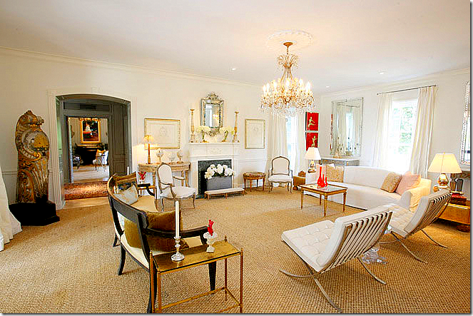
The living room as seen in the real estate brochure: The room is actually much larger than it looked in S.A. The vignette with the sofa and mirrors and consoles is not as dramatic here. Also – what a gorgeous bench! That’s a surprise. Across the entry hall on the left, you can see into the grey sitting room. I must say that the room is furnished exactly as it was photographed, except for the orange vases on the gold Venetian coffee table. Not sure what that is in the corner there (I’m just ignoring it.) I am dying to know if the Charbonnet is here – you can’t tell from this picture.
The sitting room with its grays and creams by Tria Giovan. This was another photograph that was shown on many design blogs. The Amanda Talley painting is stunning here – it really “makes” the room. I love the crystal sconces used next to the contemporary art work. Beautiful gilt French bench in ticking. The glass and acrylic coffee table makes the room more youthful and less stuffy. Rose Tarlow curtains. Just beautiful! Now, how does this room REALLY look????? See below!
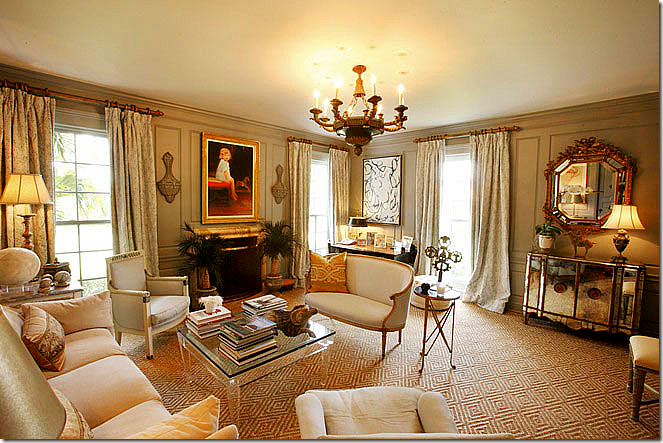
Surprise surprise surprise! The Amanda Talley has moved from above the fireplace to a side wall. Instead, a portrait of the owner’s child perhaps is there. Well…I prefer the Talley, but no one asked me of course! This room retains its beauty in this picture. You can see the mirrored console here. Notice the pattern in the seagrass rug. The chandelier is to die for – as they all are in this house. Gorgeous room! Notice how in real estate photos – they always show the vast ceiling, but professional photographers tend not to show nearly as much. Photographer Michael Lee told us on the Skirted Roundtable to sit on a chair to avoid getting that huge ceiling in your picture.
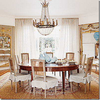 Tria Giovan’s dining room. The main attraction is the two French trumeaus in the corners. The oversized mirrors are gorgeous – as is the chandelier. The chairs are stunning, painted and caned with slipcovers. I like the casual French chairs paired with the more dressy and streamlined table. Notice how nicely framed the table and mirrors are in the photo. Just beautiful.
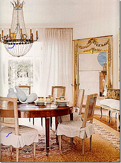 A somewhat larger but cropped picture where you can see more detail of the chandelier and the French bench on the right with its BViz pillow. How does this room REALLY look? See below:
The real estate photograph: The room looks huge – with all the ceiling showing again. As for the decor - I think I prefer the quieter rooms – the living room and the sitting room. This seems a little too colorful for me. But give me those chairs, the chandelier and the mirrors and I’ll die a happy woman!
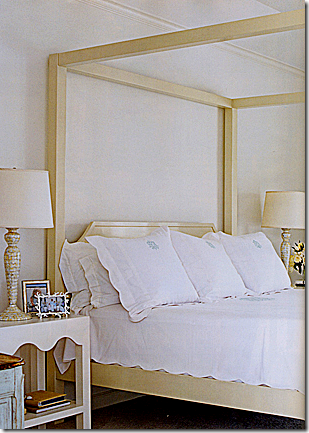 The bedroom with the beautiful Leontine Linens, of course! And how does the master bedroom really look?
Real Estate photo: Ceiling, ceiling ceiling. This room really looks huge here. Matching antique painted consoles with sconces are almost lost. Pretty Swedish sofa. I think part of the issue is the sheer size of the rooms in this house. When you get such huge rooms – you really need to fill them up with furniture, otherwise they look bare. This room could use a whole sitting arrangement in it. And real estate photographers want to show you the entire room – they don’t want it to look good, with little closeup of vignettes.
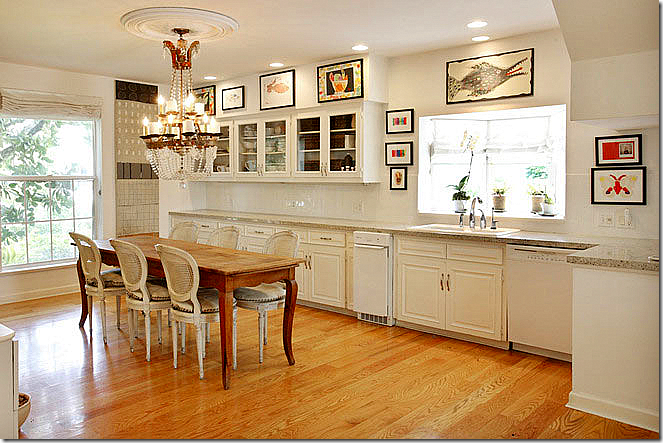 Real Estate photo: large chandelier, French table and chairs dress up the simple kitchen. No professional picture to compare it to.
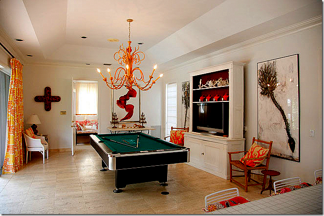
Real Estate photo: the play room. The photographer did nothing to make this room look appealing!!!
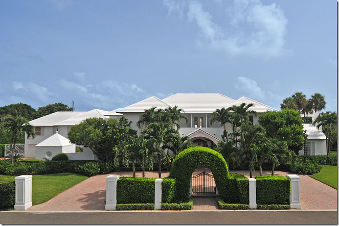 Front of the house – the house was on the market for over 12 million, but was later reduced. The web site doesn’t say if it ever sold.
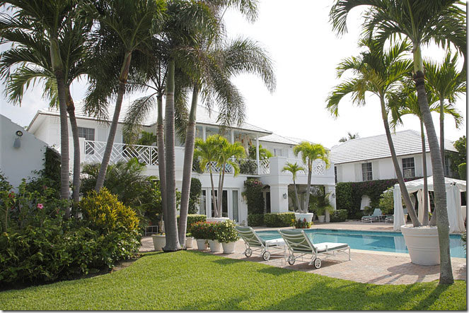 Beautiful. The back of the house.
Lesson to be learned: Always hire a professional photographer to take pictures for your portfolio if you are an interior designer. It makes a huge difference. If you can’t afford one, then borrow a good camera with a wide angle lens. Remember to sit down for pictures – if you don’t have a tripod. I’m sure this house is as beautiful in person as Tria Giovan’s photos show it to be, but it’s just such a shame the real estate photos always make the house look not as pretty as it is.
I have a series called Cote de Texas Top Ten Designers HERE (that I still haven’t finished!) and Bremermann made the list at #4. To read that in-depth look at her career, go HERE.
