In 1975, when I was just a mere babe of 20, I was enrolled at the University of Texas majoring in Interior Design, which happened to be a Bachelor of Science degree from the Home Economics department. Whoo-hoo! As a junior, we were given a design project that involved taking the floor plan of our classroom and turning it into a living space – an apartment, condo, or a loft. I had just returned that spring from a trip to NYC to visit my then boyfriend, Bert Wolf (I’ll give Bert a nice little shout-out here: Hey Bert!) and it was in NYC that I got my “inspiration” for my classroom project. You see, while I was visiting in NYC I stayed with my aunt and uncle at their United Nations Plaza apartment building, a somewhat famous address where a few years earlier Johnny Carson had also lived. My aunt and uncle, Annette and Lee Evins, were not ordinary people – they were well known in New York due to the shoe business they owned, and staying at their two story apartment (complete with a private elevator) was truly a special treat. They both were terribly stylish, Lee was a dapper Englishman, and Annette had tremendous taste - she was probably the chicest woman I have ever known – she just instinctively knew in an instant what looked good, or didn’t. I stayed in NYC for about two weeks and each day was wonderful – the Evins apartment was filled with French antiques – and I absorbed much about design just being there surrounded by it all. Even the bathrooms were spectacular: finished in wall to wall white marble, they resembled a Five Star European hotel. Surely it was the first time I had ever seen such simple luxury and beauty in a bathroom and the vision of it has stayed with me for all these years.
The Evins daughter, Melissa, still lived at home which was normal then in New York for single girls, but their son Reed, who is my age, already lived in his own apartment - and not just any apartment either. That year, he had a then up and coming designer, Joe D’Urso, create a space for him that was cutting edge contemporary, so much so that his apartment is still talked about today. Back then the apartment ended up on the cover of Interior Design and in the even headier Design Quarterly. The D’Urso designed apartment consisted of a series of carpeted platforms that you sat on in place of chairs. The platforms also divided the one room apartment into areas with different functions – eating, sleeping, living. The open bedroom area could be cordoned off with then in-vogue vertical blinds (the first place I ever saw those!) It was all very high tech - D’Urso used Pirelli tire material as floor covering in the kitchen and bath and Reed’s custom dining table was also covered in rubber and banded in steel. At that time, what D’Urso designed for Reed – the carpeted platforms, the blinds, the tract lighting, the rubber floor –was all unheard of, all totally contemporary, and all the rage. After a young Calvin Klein saw Reed’s apartment, he immediately hired D’Urso to design one for himself.
Since I was majoring in Interior Design, I was, of course, eager to see Reed’s fabulous apartment that I had heard so much about. Just imagine the sheltered little Texan, in the big city, taking it all in! I was given the grand tour of the minimalist apartment and was so impressed that I consigned even the smallest detail to memory. Later, back at school in Austin, I was studying my project that was due – turning my classroom into a living space – when I suddenly realized that the dimensions and proportions of the classroom looked very similar to Reed’s apartment – and then it hit me. I had a brainstorm that bordered on genius. I was going to copy his apartment for my project! I was so thrilled because I was convinced I would get a much-needed “A” for my brilliant design. After all, Reed’s apartment was the talk of the design world, but of course it wasn’t actually my design at all – it was D’Urso’s.
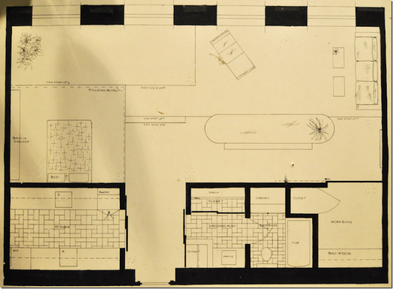
My actual project board from 1975 – I’ve kept it all these years for some reason. The floor plan is based on our classroom that we were to turn into a living space.
Looking at my project board, you can see how I transformed the classroom with its one wall of windows into Reed’s apartment. It may be hard to see, but when you walk in the front door – on the immediate left was the kitchen. The bath was on the right. The doors leading into both these spaces were sliding metal doors. Walking into the space, past the kitchen and bath, on the left is the sleeping area – elevated high up on a series of carpeted platforms. The dotted lines shows the tract of the vertical blinds that hid the bedroom from view, if needed. Straight ahead of the front door – you can see two steps which lead to the carpet covered platform that becomes the seating space for the long, oval, streamlined table that is focal point of the entire apartment. A bench serves diners on the other side. Behind the dining table is the living area with a contemporary sofa and chaise. I added a work room to the right of the bathroom – I don’t remember if that was my idea - or if that was actually in Reed’s apartment. I was so proud of this project! After all, I had turned a drab UT classroom into the chicest, hippest, most happening designed space in all of NYC. And, yes, I did feel just a teeny bit guilty about not being original, but hey – who could have resisted?
That’s moi! Joni Cohen, May 1, 1975 – the day I turned in my classroom project – exactly thirteen years before I was to marry Mr. Slipper Socks Man.
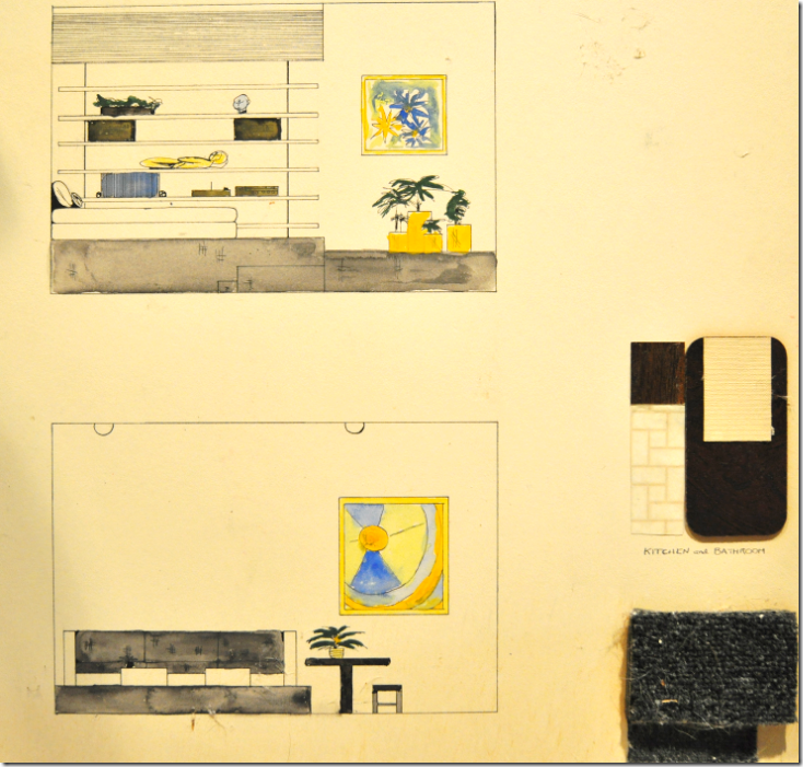
I even saved some of the elevations – disregard all the dust bunnies that are clinging to this – I found these boards in a bag in my garage and I haven’t looked at these in probably over 20 years! But here – you can see in the top elevation – the bed, with a built in shelf behind it that was hidden behind some type of high tech screen, no doubt. In the cross section, you can make out the three different platforms that lead up to the bed, which was actually just a mattress on the floor. The bottom elevation shows the sofa in the living room, again on top of the carpeted platform, and the table with the bench – there’s even a plant on top! And be sure to admire the wonderful art work I created!! At the right of my drawings is the gray carpet that covered all the platforms. I guess I couldn’t find Pirelli tire material for my kitchen floor and resorted to totally inappropriate brick patterned tile. So…..what do you think I got on my project – an A, a B, a C…..?
How about an F?!! Yes!!!! An F. A big fat stinking F!!! My teacher lectured me that it was unoriginal, boring, bland, etc. etc. Through my tears, it was all I could to do to not blurt out the truth: that is wasn’t MY design that was boring and bland, but one of the hottest designers in the country and if she didn’t recognize that, or see the genius in the work, then you know what – I was out of there! And I was. I left the interior design program two semesters before graduation. This melodramatic episode has stuck with me all these years. Tonight, looking over my other projects that I’ve saved, I didn’t even remember doing them. At all. I couldn’t even remember doing any of my other projects 35 years later. But this one, I never forgot the grade, the discussion with the teacher, the humiliation, nor me thinking that the teacher really knew nothing about design except what she had learned in her out-of-date textbooks.
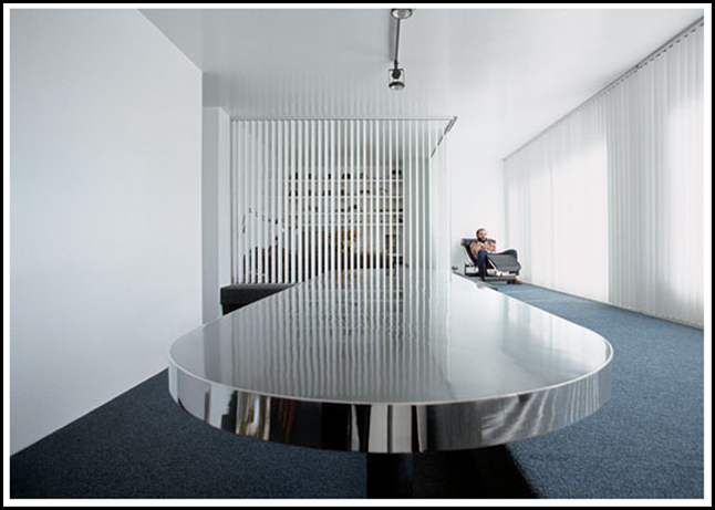
Reed Evin’s actual apartment with the rubber topped table and the carpeted platforms that divided the long room into different living areas. The bedroom area hides behind the vertical blinds.
Do you think I am exaggerating the importance of my cousin’s apartment on the newly emerging minimalistic design? Two years ago New York magazine (HERE) did a story on Hall of Fame honoree, Joe D’Urso, and included this picture of Reed’s apartment along with a discussion about it. This photograph really does look almost exactly as I had portrayed it in my project that I got an “F” on. Yet here, three decades later, New York magazine is writing about that same apartment and the effect it had on contemporary design in New York. Amazing. Should I contact my former teacher and ask for a higher grade? In this picture, you can see the long platform that served as the seating for the even longer table. Behind the screen on the back left is the bedroom with the built in bookshelf – Joe D’Urso himself is sitting on the chaise. This picture was taken in 1978, three years after my visit there. As the magazine notes, Reed’s apartment had all the hallmarks of what D’Urso came to be known for: “Glossy white walls adorned with little more than an occasional black-and-white photograph. Built-in plywood platforms covered in charcoal-gray industrial carpeting and decked out with pillows. Track lighting on the ceiling, black rubber Pirelli tile on the floor, white vertical blinds rustling in the windows. And a mechanically rotating cleaner’s rack in the closet.”
D’Urso describes Reed’s apartment this way: “There were those long, low platforms. Everyone hung out on the floor, vertical blinds to hide the bed, a Corbusier chaise, a long table with a stainless-steel edge and a reflective black rubber top, and a metal meat-market door leading into the kitchen.”
And further, New York magazine says - “Everyone who saw it wanted to throw out everything they had and hire D’Urso. Wire-and-glass coffee tables, hospital-curtain tracks, restaurant stoves, exposed ductwork, doctors’ sinks, security mirrors, marine hardware, gym lockers, and cyclone fencing: Those were the materials that D’Urso brought into the New York living space called the loft.”
Imagine - “Everyone who saw it wanted to throw out everything they had and hire D’Urso” and I got an F!!!!! An F!!!! It might be funny if it wasn’t so typical of the unimaginative minds that were teaching design in those days and probably still are. D’Urso started it all, the whole loft, minimalist movement that today is creeping back into style with the current trend towards industrial design. Asked who his mentors were, William Diamond of Diamond and Baratta says: “Joe D’Urso – we still think Joe D’Urso was the greatest designer of the 70s – bar none.” William Diamond of bright pink and green plaid fame said that? Today, D’Urso is still working and continues to be relevant. His famous metal and glass coffee table recently went for $10,000 at auction and his designs regularly turn up on 1st Dibs. He continues to design furniture for Knoll and his white marble conference table is absolutely heavenly.
This steel coffee table designed in the 80s by D’Urso for Knoll is currently on 1st Dibs for $18,000.
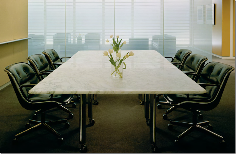
This gorgeous conference table designed by D’Urso for Knoll would make a fabulous dining table – if one could only afford it!
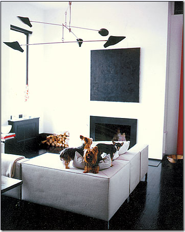
Though D’Urso has slowed down lately, he still takes on design projects. This beach house in the Hamptons was recently featured in Elle Decor. Fabulous!
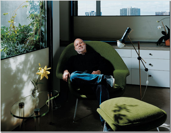
And fashion icon Narciso Rodriguez lives in a D’Urso designed apartment complete with a David Weeks chandelier.
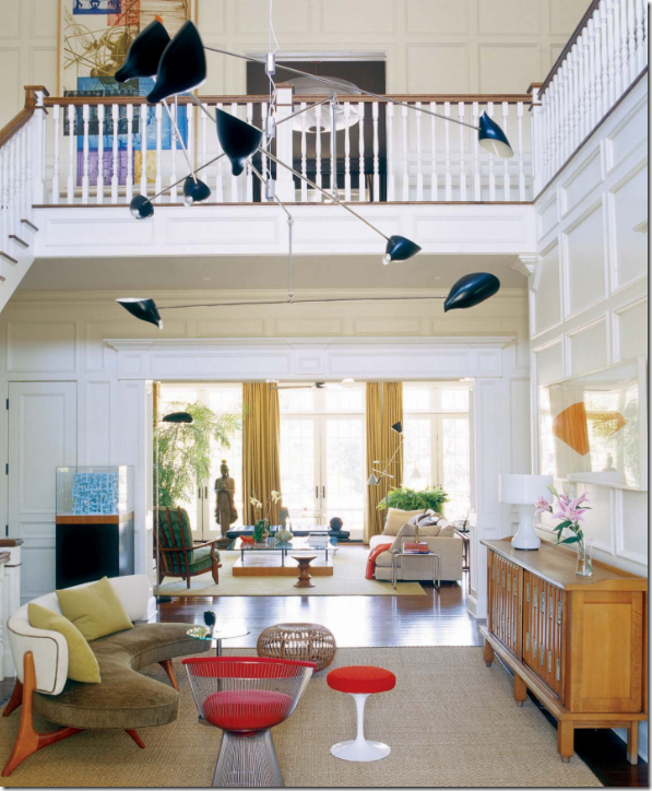 Last year Town and Country featured this Hamptons house designed by D’Urso, again with the brilliant chandelier by David Weeks, a Vladimir Kagan sofa and a Warren Platner chair.
Reed Evins, young and gorgeous!
So, WHO, you might be asking is my cousin Reed Evins and why was he living in such a chic place at the age of 19 when most of us had just barely moved out of our parent’s house?
Reed Evins is actually quite famous himself, I’m proud to say. His father, Lee Evins along with his brother David – both from England - owned a shoe company called simply, Evins Shoes. It was not just any shoe company, their shoes were worn by royalty, First Ladies, and all the greatest Hollywood stars. In fact, some of the shoes that Princess Grace had designed for her trousseau were custom made for her by Evins. Every first lady from Mamie Eisenhower to Hillary Clinton wore shoes made by Evins! Shoes were custom designed and hand made for Jacqueline Onassis, Cher, Marilyn Monroe, Judy Garland, Marlene Dietrich and Ava Gardner, among others. The Duchess of Windsor routinely had Evins custom make her shoes, which she described as “genius.” Each year Lady Bird Johnson would commission just one pair of Evins shoes, but Nancy Reagan ordered six pairs – two styles in three sizes: one size for cold weather, one for Washington DC, and a third size just for Air Force One – she must have really suffered from water retention! Evins shoes were not inexpensive, in fact, they were once the most expensive shoes you could buy: during the 1950s, the company designed a shoe that was considerably lighter and more comfortable than most had been up until that time. The shoe weighed just 6 ounces and sold for $175 a pair, when other quality heels were just $45. With a heritage like this – growing up in his father’s shoe factory – is there any doubt that Reed Evins would become a shoe designer himself?
Shoes made by Evins for the First Families. Reed has a private collection of over 3,000 pairs of shoes and this is just a small part of his museum quality collection.
After a short stint at Rhode Island School of Design, Reed was quick to leave college - he already knew everything about designing shoes and considered school a waste time. That’s how he landed at 19 in NYC, living on his own in the D’Urso apartment. For a short while he worked at Evins Shoes, but he had ambitions of his own. He started his own company, apart from his family, and joined by his sister, Melissa who became his life-long partner, they named the new business Two City Kids – for that is exactly what they were! Two City Kids were fun shoes, mostly flats, that appealed to the younger generation. Reed and Melissa worked hard to keep their prices affordable for their target audience. The company soared to early success when Mick Jaggar wore their jazz shoes on stage. After over 10 years running Two City Kids, they were hired to design shoes for Anne Klein – a job they worked at alongside another young shoe designer Manola Blahnik. The job for Anne Klein was so labor intensive that Reed was forced to close Two City Kids, though for many in the shoe business, he and Melissa will always be known as that. After eight years with Anne Klein, Reed was hired by Cole Haan to bring a fresh contemporary look to their shoe line – which he did, designing five years for that iconic company. Besides all this, through the years, Reed has created runway shoes for fashion lines such as Calvin Klein, Bill Blass, and Halston to name a few. Has he designed shoes for stars like his father did? Well, if you consider Beyonce, Sharon Stone, and Oprah stars - then, the answer is yes! Today, he and Melissa are now designing under their own label again, this time simply named reedevins – tirelessly traveling back and forth to Italy where their shoes are made. It’s great having shoe designers in the family. For years and years I wore Two City Kids religiously. Now, my daughter proudly wears reedevins.
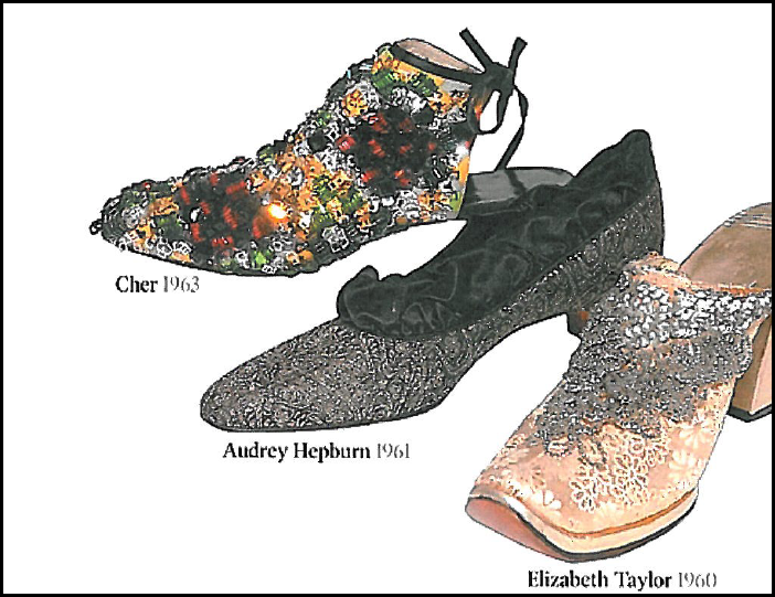
Besides eating, breathing, and designing shoes, Reed also collects them. To date, he probably has the largest private shoe collection in the world: 3,000 pairs of shoes worn by household names. Included in his collection are:
Audrey Hepburn’s “Sabrina” pump for the 1954 movie.
Rhinestone mules worns by Ava Gardner in the Fred Astaire movie “Dancing in the Dark.”
Shoes worn by the two movie Cleopatras: Claudette Colbert and Elizabeth Taylor.
Nancy Reagan’s two inauguration pumps.
The Herbert Levine shoe – the only shoe ever on the cover of Harper’s Bazaar.
Loretta Young’s thigh high boots.
And on and on, just amazing! Of course he has many original Evins shoes from his father’s day in his collection, as does the Costume Institute of the New York Metropolitan Museum of Art.
Hollywood Stars – more shoes in Reed’s personal collection.
Today – Reed’s label is simply: reedevins – made in italy. Less is always more!
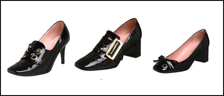
A sampling of Reed’s past collections – so adorable!
This summer his tie die line was a huge hit! So many style blogs were talking about this line, which Reed said he designed for the downtown girl, as opposed to the uptown girl.
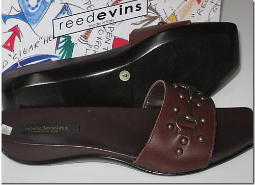
And even EBay currently has a page worth of his old designs. In this picture you can see Reed’s shoe box – which he designed using his own drawings of shoes, of course!


And a preview of Reed’s spring line for 2010 – such pretty colors!
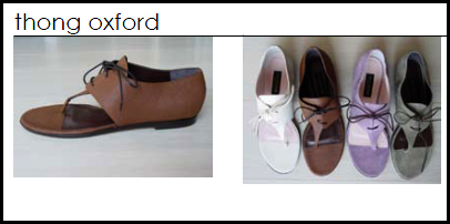
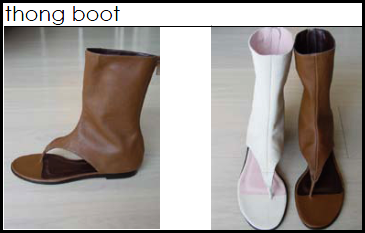
And more of Reed’s 2010 spring line, very fashion forward. My daughter saw these and her mouth started watering. She would wear the thong boot with shorts!! Ah, to be so young again.
Today, Two City Kids, Reed and Melissa – a little older, a littler wiser, but still – just as much fun as ever!
The gang’s all here but me! Reed, the famous Betty Rae – my mother, Cathy – my sister, and Melissa Evins! Do you think there is a family resemblance here?
